Happy Saturday!
As you know from the title I'm going to be sharing some inky fun with you but first I wanted to share my news... As you know I recently became a design team member for Fairy Hugs - a new line of stamps consisting of fairies, underwater creatures and similar elements. This line of stamps coordinate perfectly with Lavinia stamps (from the UK).
Well the owner of Fairy Hugs has a store dedicated to selling Lavinia stamps here in the US called Lavina World. To avoid some brand confusion among customers he has just opened a brand new web-store called Fairy Stamper that encompasses Fairy Hugs stamps, Lavinia Stamps as well as all sorts of other fairy, mermaid and mythical products from other companies. These products include stamps, stencils, dies, inks, tools and more! I am thrilled to announce that I am a member of Fairy Stamper design team!!
Fun huh? So look for more fairies, mermaids and mythical creatures in the near future.
Elements Dye Inks
You all know how much I love inks...well today I wanted to show you what I've been playing with the past couple days - Elements Inks from Lavinia available here in the United States at Fairy Stamper. These are Lavinia's answer to the discontinuation of ColorBox inks. They have come out with 12 initial colors shown here...
I decided to make a color swatch of each of these colors to share with you. One thing I noticed immediately is that these ink pads are VERY juicy. A little bit goes a long way (you'll see what I mean on the swatches). The colors are highly pigmented and very intense - check 'em out...
I applied each color to plain white 110lb Georgia Pacific cardstock using a jumbo sponge dauber. I intended to do a gradual fade from full coverage to white but as you can see that didn't happen. The application is a bit heavy handed on some colors for the simple fact that if you dab in the inkpad more than once or twice you're going to get A LOT of ink on the sponge. Seriously the Sundance was pounced onto the pad twice and it completely covered up the square. You can just barely see where I stamped the mushrooms. I tried to lighten it up after that but these inks do take some getting used to.


Beautiful colors but I must say I was a bit confused about the Henna and Truffle - I personally think the names should be switched because to me Henna is a reddish brown and Truffles (chocolate truffles that is) are chocolate brown. I was also surprised that there wasn't a red included in the mix. I'm thinking they may have had the Merlot in mind for that part of the rainbow but I think it's more purple than red. Again - that's just my own opinion. Maybe they will come out with more colors in the near future to fill in the gaps.
Overall they are beautiful, highly saturated colors that stamp great. I did want to show a bit of play I had with them on a gel plate. This is a technique that is very popular over in the UK to pair with the Lavinia stamps so I thought I'd give it a go with their inks.
You use a brayer to roll on the inks onto a gel plate which I have done here... Normally they use one color but as you know if you've been here long I don't follow directions very well and like to do my own thing so I put on two colors. This example is Pine and Sundance. I should note that I only rolled the ink onto the very end of my brayer...about 1 - 1 1/2" on each end - you don't need any more than that or you'd just be wasting the ink. Next, flick on a bit of watered down Brusho's (a dry pigment ink) then press a piece of paper over the ink.
Now I really started getting into it and forgot to take pictures for a bit. The center one in this photo is from the Sundance and Pine. I can't remember what the combo's are of the others...to much fun was being had.
As I realized part the way through that I had forgotten to take pics...I picked it up here - this is Blue Lagoon and Mermaid after 1 pull. I didn't roll on anymore ink, I just left the ink as is and flicked on a bit more Brusho's just to see what would happen. I am happy to say that I was able pull a second sheet with lots of color from the inks/brusho's.
The image on the right was the first pull from above, the center sheet is what I pulled from the combo shown in the photo above. The one on the left was made by rolling the existing ink/brusho over the gel plate, flicking on more Brushos and a third pull. I told you these inks were intense...3 pulls from just one inking.
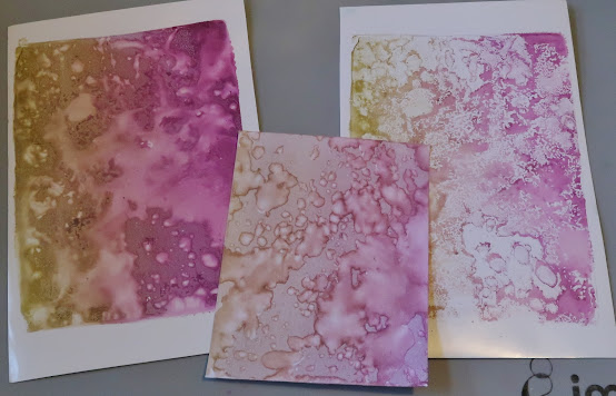
These examples are Sahara and Merlot - 1st, 2nd and 3rd pull in that order.
The final set was made using just Mulberry.... o.k. I tried one color but actually I think I like the bi-color better.
I'll leave it here for now...Hope you've enjoyed these experiments with this fun new ink.
I will be sharing more experimentation with these inks in the near future.
Till then friends - stay inky!!


congrats Roni. glad to see all those happy fairies flying around. thanks as always for sharing.
ReplyDeleteThank you Theresa :) I can't wait to share more!!
DeleteYour papers are pretty, Roni! Thanks for sharing all of this info!!
ReplyDeleteThank you Bonnie! I always have such fun experimenting.
Delete