Saturday, March 31, 2018

Big Hugs

Getting a jump start on a Mother's Day card for Mom today...


This month's color at Imagine was Ultraviolet...I knew it would be a perfect pairing with this marble stamp from MFT. It looks great on this Mother's Day card I made for mom.  She loves purple and I hope she'll like this.


I tried to show the sparkle of the embossing powder in this photo....it looks amazing in person.

For the complete supply list and tutorial please see:


Friday, March 30, 2018

Princess of Everything!

Just playin' around with one of my stamps I haven't used in a while...Princess of Everything!  Isn't she great? 


The card is assembled using an old bingo card that I swished around some watercolor paint, the white piece in the lower right corner was made by sprinkling on a bit of Nuance powdered pigments on watercolor.   After I stuck them down to the card I flicked on a bit of blue watercolor paint.  

The little princess was stamped with VersaFine Clair Nocturne ink and then colored with Prismacolor colored pencils.   I fussy cut her then pop dotted her onto the card.  The sentiment which is actually below the image when stamped was cut, glued then outlined.

I added the sparklie washi tape to the side just for an extra bit of bling.  You can't see it in this photo very well but her pinafore has a bit of micro fine glitter along the edges as well.

This card fits into the challenge over on Lost Coast Portal to Creativity's challenge: Say What??


Supplies:

Lost Coast Designs - Princess of Everything
Imagine - VersaFine Clair - Nocturne; On Point Glue; Tear It Tape
Nuance Pigment Powders
Prima - Watercolor Paints
Prismacolor Colored Pencils
Washi Tape 
Vintage Bingo Card

Tuesday, March 27, 2018

Painting Negative Space

Oh my...recently I saw a really cool video from The Pigeon Letters - Peggy Dean where she painted the negative space instead of an image.  It was very inspiring and despite never having tried it before I wanted to give it a shot.  It's way harder that I thought it would be.  I made 2 so far and I like the first one the best (orange). 


I did far better on my first attempt because I actually drew out what I wanted it to look like on paper before I began.  The pink version was just painting stuff...no real plan to go by.  I often have a war  going on between the left brain/ right brain. One side of my brain is very organized and I like to have structure - a plan - a guide if you will but then the art side wants to be free and just do whatever. It makes it difficult to actually produce what I see in my head.  This is one exercise I need to continue with so I can mesh both into one.


I started off with the yellow...


And added the pink. 


You can see some of my ideas didn't quite work out...the upper R flower was supposed to be spikey but my brush was way too wet, I ran the flower in the upper L a little too close to the edge so I had to smoosh it up a bit.  I do however like how my tulip and a couple of the leaves turned out.

Now see how a pro does it....


Thursday, March 22, 2018

Stampin' Trees

Hello Friends!  I hope you're all doing well today.  I know many of you have been battling a late winter snow storm - I hope you're all safe and snug wherever you are.

Today I wanted to share a couple of cards I made today using the UM stamp set - Trees from Rubber Stamps Tapestry.


The first card was made for my sweetie...  I stamped the bare tree using VersaFine Clair Pinecone.  I then used a peg stamp that is called "Heart Dust" (isn't that darling?) to stamp the VersaFine Clair ink colors Glamorous (deep pink), Tulip Red and Charming Pink (bright pink)  VersaFine Clair.  You won't believe what I used for the grass...a Pineapple Top! It worked like a charm :)


This is a more traditional spring tree filled with lovely flowers and a sprinkling of flowers beneath as well.  A picture I'm sure we're all ready for!  The background for this card was stamped with a tri-flower stamp using VersaMark ink.

Supplies:

Rubber Stamp Tapestry - Trees UM set; Heart Dust, Pineapple Top, Oak Leaf, Flowers Three Ripply, Cherry Blossoms
Imagine - VersaFine Clair - Pinecone, Acorn, Tulip Red, Glamorous, Charming Pink, Verdant, Green Oasis, Golden Meadow, Blue Belle; VersaMark
Club Scrap - cardstock
Altenew - Painted Greetings
MFT - Stitched Dies

Tuesday, March 20, 2018

Easter Bunny Plaque

Hello Friends!  I wanted to make a little plaque for Easter and I had this darling Marshmallow Bunny stamp from Just For Fun Rubber Stamps!


Here's how I made it....


I started off by cutting the basic plaque shape from a piece of chipboard.


Inked it up a bit and stamped the sentiment on the top.


Next I sponged Radiant Neon ink on cards,


Stamped the image with VersaFine Clair Nocturne (Black)


Embossed and cut them out.


I knew I wanted a bit of grass for the bunnies to hide in so I cut up some paper grass that I then glued to a strip of foam board.


Added bunnies to the card with double stick foam tape, 


Trimmed up the grass 


Added it to the plaque and finished it off with a few flowers and paper twine.


Ready to greet guests!

Supplies:

Imagine: Radiant Neon Ink - Electric Blue, Electric Yellow, Electric Purple, Electric Green, Electric Pink; VersaFine Clair - Nocturne, Acorn; Memento - Rich Cocoa; Embossing Powder; irRESISTible Pico Embellisher - Wedding Dress; Tear It! Tape; On Point Glue
Just For Fun Rubber Stamps - Marshmallow Bunnies
Prima Marketing - Flowers
Chipboard, Foam Board, Double Stick Foam Tape, Paper Twine; Easter Grass

Wednesday, March 14, 2018

Succulents

Hello friends...I hope you're having an inky day!

Today I have 3 totally different projects featuring one stamp set - Succulents by Rubber Stamp Tapestry.


My first project uses a canvas I made using yesterdays technique of pairing pigment powders ~ in this case Lindy's Magical Shakers ~ with white glue.  The succulents were masked & stamped then colored with Chameleon Markers and fussy cut.


My next project is this fun "congrats" card I made using the hen from the set.  I stamped the succulent with VersaFine Clair Nocturne (black) then stamped a circle of color over each image (Verdant and Chianti VFC).  I added the little dots using a peg stamp then added the die-cut sentiment.


I had lots of fun with the final card.  I stamped/masked the succulents with white ink on black cardstock. I then colored the succulents with a fun set of colored pencils from Crayola designed to work on dark cardstock.  There are so very pretty metallics and shimmery colors in this set.  I was totally surprised, it is NOT what I was expecting from Crayola but boy did these pencils deliver.  

As luck would have it this months challenge at House of Cards is to use colored pencils on dark cardstock!  I'm happy to enter this card into their challenge.


Image result for design hues pencils

Supplies:

Rubber Stamp Tapestry - Succulents
Imagine - VersaFine Clair, Memento Luxe
Lindy's Magical Shakers
Crayola - Colored Pencils
Club Scrap - Cardstock
Canvas
White Glue
MFT - Die-Cuts

Tuesday, March 13, 2018

Pigment Powder Glue Art

Today I wanted to share a fun idea...combining your pigment powders with glue.    I did this quite some time ago and paired the pigment powders with a clear gloss glue but decided to give my new Lindy's Magical Shakers a try with plain old white glue on canvas and here's how it turned out....


These turned out so pretty...I wish you could see the shimmer from the pigment powders IRL...they sparkle and shimmer like you wouldn't believe.


All I did was spread a layer of white glue over the canvas then sprinkle on the powders.  I left it to dry and the results are what you see.


I wasn't to show you the amazing texture of the surface of the canvas...it's really cool looking...


The speckles that show up really well in this photo are the bright shimmer of the powders...some areas the color is more prevalent, other places it's the shimmer.  Just such a nifty result.


This is another canvas I did but I misted the top of the glue with water before sprinkling on the powders.  I also took a tool and made circles in the glue right after I sprinkled the powder on.  You can see that (because of the water) the colors traveled more freely but the glue did hold some of the swirly designs.  

I think this is going to be a really fun technique to explore more in the future, more ideas rolling around that I want to try.

Monday, March 12, 2018

Still Winter...

Well, I should know not to get in a hurry for Spring here in Indiana...I was hoping that we were done with the snow but alas today those darn little flakes are falling again!  So rather than complain (more than I already have) I thought I might as well join 'em!

Stamps: Rubber Stamp Tapestry - Woods in Winter
Paper Smooches - Hello from Scripty Sayings

My first card was made by pouncing Fresh Greens Kaliedacolor ink pad on my craft mat and spritzing with Ink Potion No. 9.  I smooshed the cardstock into the ink and picked up the smaller bits over and over to give a really pretty layered depth to the greens.  I stamped the tree with a combo of VersaFine Clair (Rain Forest) and Rich Cocoa Dual Tip Marker (on the tree trunk).  I then stamped the birds again with VFC - Red Tulip and the "Hello" sentiment with VFC Nocturn.  I then stenciled on the falling snow with gesso and smeared a bit more along the bottom of the panel free-hand.

Stamps: Rubber Stamp Tapestry - Woods in Winter (pine trees);
Budding Spring (rabbit)

This card was lots of fun...I love making winter pine forests - they always turn out so pretty!  The pines were stamped using VF Clair - Morning Mist (grey), Twilight (grey blue) and Rain Forest (dark green).  The sky is a blend of blues & purples applied with a sponge dauber then misted with Mister Huey's Opaque White spray.   I stamped the bunny then sponged on a bit of pink on his ears and grey on his fur coat.

Stamps: Rubber Stamp Tapestry Woodland Harvest (Tree);
 Woods in Winter (birds); various Peg Stamps - flowers, grass, snowman, snowflakes, etc.

My final card was made in hopes that we could move along from Winter snow and cold into Spring!  I am so ready for a bit of color ~ other than brown (grass, trees, etc) to green on the grass, trees and maybe even some flowers to oooh and ahhh over!  


So what season are you currently experiencing?
Has Spring sprung in your neck of the woods or are you still "enjoying" winter?

Wednesday, March 7, 2018

Seth Apter Baked Texture Embossing Powders

Hi Friends!  I am so excited to be able to share a project I made using Seth Apter's new embossing powders - Baked Texture.  If you've not seen them before you're in for a treat. He partnered with a Canadian company - Emerald Creek to bring his creations to reality.  These powders are NOTHING like any powders you have sitting in the back of your craft drawer.  These are a whole new way to envision embossing and I love 'em!!  I have loved embossing from the get go when I first discovered stamping but was saddened that it fell out of favor.  I am hoping this will help bring embossing back in a big way!


This is a piece of wall art I made using each one of the different powders available at this time....I was going to add a die-cut or sentiment on it but I sort of like how it looks as is.  I'm going to leave it as is for now.

Note: all examples were made using VersaMark Ink by Imagine.


Deep Sea...a lovely mix of chunky clear and blue powders - the more layers you add the less you see the clear and it turns into a deep rich blue - you can see how it varies from the speckled white to the darker areas which comes with each additional layer of powder.


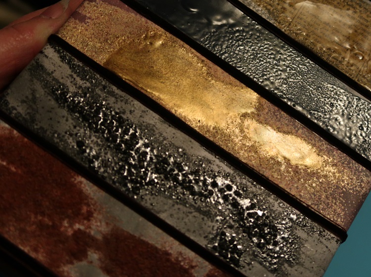
This is probably my favorite...Chunky Rust.  It has tiny little flocking hairs mixed in with a copper color powder. It is AMAZING!!!  It really looks like rust  - the area on the example near the lid is just a single layer of the powder, the center and right has multiple layers of the powder.  The more you add the thicker and rusty-er it looks!


Vintage Beeswax...it really does look like beeswax!  Thinner layers is just a touch of yellow in the mix...thicker colors like on the text really get the lovely warm yellow which can be cracked just like UTEE (Ultra Thick Embossing Enamel). 

NOTE: This ep finishes with a very shiny surface (unlike beeswax), to give it the authentic look SA recommends applying a layer of matte multi-medium over the surface.  I have an easier fix, just take an eraser and rub it over the surface of the cool embossed area!  It takes the shine right off (you can see it in one of the examples below.  This technique will take the shine off any glossy embossing.


Patina Oxide - Super cool green and copper mix...the more you add, the more mixed it will look.  Very pretty.


Dirty Sand - Stuff is really cool, it does feel like sand when it's cooled. It has a rough gritty texture that is going to be so cool on beach and outdoor themed projects.


Rocky Road - I think this is my 2nd favorite - this stuff is wicked cool...really chunky, textured finish - if you want.  You can melt it a lot to get it all smooth and glossy or add a 2nd or 3rd layer leaving those less melted to create lots of texture.


Ancient Amber - this is a very pretty tarnished gold effect...less powder is amber more powder is gold.  Lots of possibilities.


Once my strips were finished I decided to turn them into art...I sponged on VersaFine Clair Morning Mist (a soft grey) over the white areas to really make the embossing stand out.


Then mounted them to a canvas using Creative Medium.  I had sponged the canvas with a trio of browns and copper but when I adhered the embossed strips to the canvas it looked muddled so I used some dark brown velvet ribbon to cover it up and add a bit of definition between each piece.  Turned out much better.


I wanted to share the following photos to show the texture of the various powders for you to enjoy...


This is the photo that shows the "matte" beeswax after it had been rubbed with an eraser.  It started out just as glossy as the Deep Sea ep below it. Quite a difference don't you think?


Top to bottom: Patina Oxide; Dirty Sand; Vintage Beeswax; 
Deep Sea; Ancient Amber; Rocky Road and Chunky Rust

Over all I have to say that these powders are well worth the asking price. These powders are nothing like anything you've ever thought of in an embossing powder. My only hope is that Mr. Apter brings out more of these fun powders in the future!  I'll be first in line to place my order!

Supplies:

Seth Apter Embossing Powder
Imagine - VersaMark Ink; VersaFine Clair, Tear It! Tape; Creative Medium, Sponge Dauber
Canvas Corp - 6x12 Natural Canvas
White Cardstock