Monday, April 11, 2016

Mother's Day Mixed Media Canvas - Part 1

Today I wanted to start a new project with you - a Mixed Media canvas for Mother's Day.  Usually I have a photo to share of what the finished project will look like but not this time.  This is a very involved canvas which has multiple layers which focus not on stamps, images, or wordage but on the texture created with various DecoArt products and techniques.


The first initial canvas is a 14x14 natural canvas that I had been primed (with gesso) and painted with a couple layers of red paint.  I abandoned that project long ago and the canvas was just sitting there unloved in my closet for quite some time. 


Since the canvas had been gessoed previously I started off by painting over the red with a coat of Americana Titanium White acrylic paint.


I wanted to create lots of texture so I decided to do so by gluing down pattern tissue paper to the canvas using Decou-Page Matte Medium. I didn't want or need the shine since this layer is going to be covered by many layers of paint.


When laying down the tissue I made sure there were lots and lots of wrinkles in the tissue.  You can gently push the tissue around once on the canvas but you must be very careful because the tissue is very fragile and can be torn easily.  If you do happen tear a hole in the tissue you can tear a small bit of tissue to glue down over the hole.  Nobody will know once it has been finished.


After you have covered the canvas apply a final coat of the glue to the entire canvas and let it dry completely.  This may take some time depending on how wrinkled your tissue is when it was applied. 

NOTE: I didn't bother with the center of the canvas as I will be adding another board on top of this in later steps.


The next step is to dry brush a layer of Americana Titanium White over the tissue.  It's o.k. if bits of the tissue peek through.


Now it's time to begin building our colors.  No need to wait for the white paint to dry, immediately apply Cobalt Teal Hue approximately 4" around the outer edge of the canvas.


The second color layer - Cobalt Turquoise Hue - will be blended in about 2" in from the edge. You will want to blend the Cobalt Teal and Cobalt Turquoise at the 2" mark to create a natural fade from one to the next.


Finally apply Cerulean Blue to the very edge of the canvas blending with the Cobalt Turquoise about an inch or so in from the edge.  I also used this color to paint the side of the canvas as well.


Here is what the canvas looks like at this point.  You can see it has a nice graduated color going on.


Now to add a bit of shadow and depth to those lovely wrinkles we created at the beginning.  Toss away those brushes, it's time to get messy.  Squirt a bit of Dark Grey Value 3 Fluid Acrylic to your fingers and rub it over the wrinkles in the tissue.  Some of the paint will get squished into the creases and crevices which is perfectly fine.  This will only add more depth to the texture you've already created.


Looks amazing doesn't it?  Well, we're not done!


As soon as the grey has dried, go back in and again using your fingertips lightly rub Champagne Ice Metallic Luster medium over the canvas hitting the top peaks of the winkles.  This will really bump up the texture to the next level as you can see below.


This is where we'll leave it for today.  Tomorrow we'll pick up and start on the next level of this creation.

DecoArt Supplies:

Americana Titanium White Acrylic Paint
Decou-Page Matte Medium
Media Fluid Acrylics - Cobalt Teal Hue, Cobalt Turquoise Hue, Cerulean Blue, Dark Grey Value 3
Metallic Luster - Champagne Ice

Sunday, April 10, 2016

Recognize This?

Does anyone recognize the background on this journal?


It is the hand stamped fabric I made for my 


How cool is that?  The journal is put out by a small indie printer that was looking for a piece of vintage fabric and was surprised to see it was something I made.  She asked if it would be o.k. to use it for the journal background and of course I said yes.  Fun huh?  You just never know where your art might end up.


Saturday, April 9, 2016

Dahlia Sympathy Card

Unfortunately, sympathy cards are a necessary evil when you go through this thing called life.  While they aren't fun things to make or have to use it's nice to put some time into them to help convey in our own way love for those left behind.

Luckily I didn't have to make one this week but this weeks challenge over at Just Add Ink #306 was to make a sympathy card.  As it happens one this months stamps in the Dahlia Club Scrap kit  also included a sympathy sentiment so it was meant to be.  


I used the card sketch from Can You Case It's #114 challenge to create the card.  The images were stamped then watercolored with Prima's watercolor confections.  Each image was then fussy cut and mounted on the card.


I made the elements along the dividing line very dimensional by embossing the backs and popping them up with a bit of double stick foam tape.    Hopefully I won't have to use this card for a very long time!


 photo badge1_zpse398c447.jpg

CYCI#114

Supplies:

ClubScrap.com - Dahlia Kit Stamps, Paper
Imagine Crafts - Memento Dye Ink
Prima - Watercolor Confections
Tag Die


Friday, April 8, 2016

Color Burst Stain Glass Effect

So this month's Club Scrap Technique Challenge is the Stained Glass technique!  I love this technique because the results are always a beautiful surprise.


This is one of the cards I created.  This piece represents the most traditional idea of Stained Glass the best - a pane of glass with mosaic of beautiful pieces of glass.  I used a variety of colors - I can't really tell you which ones though - I usually dump my bottles on the table and just grab n sprinkle.   

Here's what you do...


Stamp desired image(s) with VersaMark ink...


Sprinkle on Black EP then heat to melt to the powder.


These are the first 2 I made...


Sprinkle on the powders wet with water and let the powders do their magic.


I do know I used Violet and Orchid on the flower - 
Indigo and Turquoise on the background.


My final card really doesn't fit the idea of stained glass but I was having so much fun stamping, embossing and sprinkling on the powders I just kept going.  It was fun to make even though it doesn't fit the challenge.  I guess we can think of this as a bonus card - LOL!!

So there you go...have you tried the stained glass technique?  If not, you really should - you'll get caught up in the inks and powders - you just never know where it will lead you.

Supplies:

ClubScrap.com - Cardstock, Rubber Stamps, Die Cut Tag
Color Burst Powders
Imagine Crafts - VersaMark Ink, Black & White Embossing Powders, Memento Dye Ink


Thursday, April 7, 2016

Altered Candy Tin Swap - Sign Up Here!!!

Yes, I am running two swaps at once!  Crazy I know but hey, never claimed to be sane ;)  LOL!!  I've had requests for this swap every so often since I had the Altoid Tin Art Festival a few years ago.  Now's your chance to join in the fun!

Altered Candy Tin Swap 
Sign Ups - 4-7 - 4-22
Due Date May 14, 2016
(must be in my hands by this date)

altoid tins 033

altoid tins 034

Details....

  • This is a one for one swap...if you make one tin you receive one tin in return...if you make 5 (different) tins you will receive 5 different tins back!
  • You can sign up for up to 5 tins but each tin must be different to aid in swapping tins out.
  • The tin you alter must be made of metal.
  • I didn't specify Altoids tins because there are many different metal candy tins out there...the usual rectangle Altoids tin, circles, squares, etc.  The choice of tin is up to you, it should be no smaller than 1" and no larger than 4"
  • You may use any theme you like to decorate your tin - the outside MUST be decorated, inside decorations are optional.  If the inside isn't decorated please add a goodie or two for the lucky recipient.
  • Have Fun!!!

Participants:

1. Roni
2. Dixie (a.k.a. Mom)
3. Susan
4. Heidi
5. Leslie 
6. Brenda
7.Jeannie M
8. Dash Cam
9. Ina G.
10. Diana
11. Olga
12. Jan J
13. Terry D
14. Nancy E.

Spring Pocket Letter Swap - Sign Up Here!

              Spring Pocket Letter Page Swap
Sign Ups - 4-7 through 4-22
(names/addies sent out 4-23/4-24)
Ship Date 5-7-16

(YES, this swap is open to international friends!)

For those of you that participated in the last LP swap you know what fun is in store...for others you might be wondering what is a pocket letter?  Think of Pocket Letters as a set of ATC's with a few extra goodies thrown in.  Basically you take a 9 hole Baseball Card page; make an ATC for each space (more on this later) and tuck in little surprises behind each card...and don't forget the letter part!  Tuck a note into one of the pockets telling your friend a little bit about yourself (if you don't know them) or if you do let them know what's going on in your life at the moment.


Each pocket can hold a card with the same general theme yet each with a different design.


(Pocket Letter by Karen W)

You might sprinkle gifts on both sides...

(Pocket Letter by Loretta)

You could choose different designs for each card.


Or it could focus on a single color scheme.

(Pocket Letter By Heidi)

You could even make a pocket letter by creating a large scene then cutting it up to fit into the pockets.

Whatever you choose your pocket letter should be filled with art from your heart! 

Remember the back is just as important as the front of your Pocket Letter.  You should add a letter in one of the pockets, telling the recipient a bit about yourself, maybe about where you live, work, your art, etc.  The remaining 8 pockets can be filled with anything you can fit inside...it could be stickers, die-cuts, sticky back gems, buttons, eyelets, vintage ephemera, washi tape, glitter tape, fibers, ribbon, charms, pins, brads, twine, felt pieces, gemstones, etc.  Virtually anything you can think of.  You can also add little treats too - tea, cocoa, sweets, mints, etc. 

HOW IT WORKS: 

  • You can sign up here for one or two spots - Sign ups run from today through 4-22.
  • Once sign ups are closed I will send you a name and address of the person you will be sending your Pocket Letter to. 
  • Make a pocket letter and fill it with goodness (you can start on this right now if you like).
  • You should mail your Pocket Letter to the recipient no later than May 7th, of course you can send it earlier if you would like.  Once your pocket letter has been mailed, send me an e-mail with the confirmation number so I can keep track of everyone's progress and to make sure nobody is forgotten.  You will not go without receiving a PL...I make sure of it :)
  • Stalk the mailman for happy mail!
  • When you receive your pocket letter, PLEASE let me know and send a thank you to the person who sent it! We all like to receive an acknowledgement for our work :)


PARTICIPANTS:

Please post an e-mail addy when you sign up so I can send you an e-mail to obtain the necessary info. for the swap.

1. Roni
2. Dixie (a.k.a. Mom)
3. Karen W.
4. Heidi
5. Pam P.
6. Ruby W.
7. Dorothy
8. Ike
9. Jeannie M
10. Jackie C.
11. DotMc
12. Donna N.
13. Anita M
14. Carolnyn J
15. Ina G.
16 Theresa P
17.Dianne R.
18. Nikki C.
19. Olga B.
20. JeniRuth
21. Pam M.
22. Michele
23. Sue

Wednesday, April 6, 2016

Pigment Powders & Embossing Folders

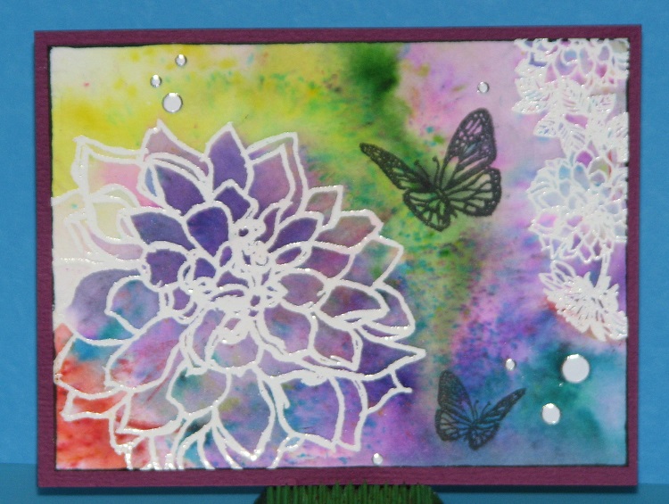
Today I wanted to put a twist on using pigment powders (Color Burst, Brusho, Nuance, etc) paired with embossing folders.  So many times I see where people sprinkle the powders on the embossing folder then spritz with water...  It does produce some pretty results but I thought it would be fun to see how it would change the look if I spritzed the paper with water instead... and here's how it turned out!


I love how it turned out, the colors seem to be more vibrant and saturated using this method of delivering the water.  This technique uses less water so more of the colors soak into the paper rather than getting squished out of the folder as it does with the other method.


In this close up photo you can see how the individual little specks of color are absorbed into the paper rather than being blended or washed away.   A fun alternative to an already great technique!

Here's what I did....


I started off by trimming a piece of watercolor paper to size then spritzed it with water and set it aside.  This gives the water a chance to soak into the paper a bit.  You want to the paper wet/damp, not dripping.


While the water was being absorbed on the paper I went ahead and sprinkled the desired colors of pigment powder over the embossing folder.


I then placed the piece of watercolor paper in the folder, closed it up and ran it through my Big Shot.  And this is how it turned out!


Here is the orange/yellow piece...


I wanted to see what it would look like if I rubbed a coordinating ink over the embossed areas on the blue example....


Again, another fun result!  
The inked embossed areas really set off the pretty pigment powders.

So there you go, a fun twist on a very popular technique
and the best part is that this will work with any of the pigment powders on the market.

Distress Crayon Winners!

Hello everyone...time for some winners!

The winners of the Distress Crayons in no particular order are....

I would like to win this prize because I want refresh my stamping syle and want to try new things. COLLEEN cdmoore@shaw.ca

I really appreciate your honest sharing of these products. It also gave me some insight into some other products I have considered. I think I would invest my money in one of the others but would still love to have a set of the DC to just try out for myself. Thanks.

I have really enjoyed these product reviews. The only watercolor crayons I have are the Lyra Aquacolor ones and I like those very much. Thanks for a chance to win a set of of the Distress crayons. They sound interesting to try on some of my more collage-y pieces. Happy Easter! Anne

Thanks for the great review. I haven't had a good feeling about the Distress crayons and this review proofs I'm right ;). I already own Gelatos so I'll stick by it.

i love your comparisons. you basically read my mind and answered every questions I had regarding the crayons!! thank you for the opportunity to win a set of crayons!! keep the demos coming...love them!

Thank you for this comparison. I also wouldn't mind trying them out. I am one of those that need to play hands on for myself. I am on your Facebook as well so it will be easy to contact me.


CONGRATULATIONS!!
Please e-mail me your snail mail addies so I can drop your goodies in the mail!


Tuesday, April 5, 2016

Steampunk Flower Pendant

Recently I joined a swap where you had to make a Steampunk Flower Pendant charm on the Facebook group - Art Charms.  I have been thinking about what to make ever since.  I knew I wanted to include lots of copper (it's my fav. metal color), a few gears and of course a bit of ink just because that's my thing.

Here's what I came up with....


What do you think?


I actually made 3 of them - 2 for the swap and one for me to keep/wear.  I am really happy with how they came out.  They have depth, different textures, a bit of sparkle (gemstone brad in the center) and lots and lots of copper.  Very me :)

Here's how I made them....


First I started off by die-cutting several flowers from copper - 2 large flowers for each pendant.  Some of the metal was inked before I die-cut (shown above) then embossed with a mini gear embossing folder.  I ran out of the inked copper and cut a couple plain copper then swiped the ink across the flower after it was embossed.  (see the bottom pendant in the photo showing the 3 charms.)  I think I like the pre-inked charms better - it's got more of a grunge look to it.


Next I die-cut a few flowers from gold colored aluminum metal that I inked with Spiced Chai Stazon to highlight the embossed texture.  I also die-cut some copper mesh (not shown).


And finally a few leaves which were embossed & inked with both Emerald City (darker green) and Spiced Chai StazOn ink.  LOVE the mix of colors.  Looks so pretty in person.

NOTE: I sanded all of the edges of each die-cut piece so it didn't have any sharp edges.


Time to assemble!  I used an oval filigree piece as the foundation for my pendant.  I started off by attaching the leaves to the pendant with a mini brad.


Next I gathered up all of the various flower components, a couple gears and a gemstone brad.  I poked holes in all of the flowers; threaded each element onto the brad in the desired order and secured the back of the brad.


I attached the flower to the pendant using Aleene's Glass Bead Jewelry Glue.


Here's the back just in case you were wondering what it looked like...
I also added a jump ring and lobster claw.

What do you think?  
Hope the recipients enjoy them.