Saturday, November 14, 2015

CYCI -#94 - My Card Won!

Wow, as you know I've recently started joining in challenges to mix things up a bit and low and behold in my mailbox this a.m......


My card won!!!

designteampick-001

What fun :)

Friday, November 13, 2015

Luxe Linen

Today I am so happy to share a fun project with you....Luxe Linen!  It's my take on spicing up boring old linen napkins into something you'll be proud to tell people you did it yourself.


And it's featured today on IMAGINE Crafts blog!


I used a variety of Memento Luxe ink pads to create this beautiful leaf on an old linen napkin.  Of course you could use stamps for any holiday, occasion or just because to brighten your meal time. 

For full step by step directions and supply list see: Luxe Linen

Thursday, November 12, 2015

A Cool Little Blue Bird

I don't know about you but I'm tired of cold weather already and it's only November!   Today we're having not only cold temps but we actually have a wind warning!  60+ MPH gusts....Eeek!   I think it's going to be a LOOOOOOONG winter!  Today since it's so stinkin cold out my thoughts are once again turned towards cooler winter projects. 


Stamps
Background Snowflakes - Chapel Road Art Stamps
Blue Bird - Unity

His little hat has fluffy accents thanks to IMAGINE Crafts Radiant Neon Amplify! medium.  It puffs when you heat it...  That was the best part of this card - my hands were warm when the heat tool was going - LOL!!

Hope you're all staying warm and take a bit of time to get inky! 

Wednesday, November 11, 2015

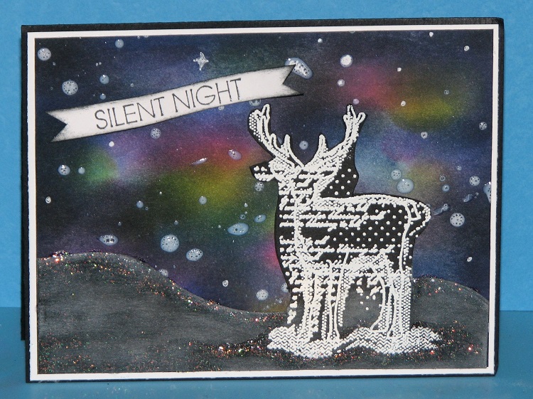
Silent Night - Northern Lights

Well today I broke down and made a Christmas card!  Normally I like to wait until it's a bit closer to Thanksgiving to start breaking out the Christmas stuff but I couldn't resist.  I saw a beautiful inspiration photo (from Viva Las Vegas) for their November challenge...it was a lovely turquoise/blue night sky scene which reminded me of the Northern Lights technique (which I haven't done in ages) so I figured now was a good time to pull out my inks and get a little ink stained!

When I finished the NL background it reminded me of a winter snow storm so I pulled out a fun Unity stamp and finished it off like this....


 Unity Stamps - All is Calm & Bright (deer)


So here's what I did...I started off by inking a piece of white (georgia pacific) cardstock randomly with several colors.  I started off with yellow, 


then added Rose Bud, Summer Sky, Teal Zeal, Bahama Blue, Paris Dusk and Elderberry in that order.  Of course once I got to inking I totally forgot to take photos!  (that happens sometimes).


Then I added Tuxedo Black around the edges and randomly in the center of the card to tone it down and make it look more like a dark night sky.  That is your northern lights background...I know it looks a bit funky but then you add stars and it really comes together.  Of course I didn't photograph that either but I did so by flicking on Wedding Dress (white) irRESISTible Texture Spray.  


For my main image I wanted to use the Unity deer so I stamped it with VersaMark and embossed with white ep.  I knew I wanted to make rolling hills but it's difficult to trim a nice even hill so I used a MFT snow drift die.  The problem is I didn't want to chop off my deers legs so I cut two small nicks on either side of the image, slid the die through and run it through my Big Shot to cut! 


All I had to do then was trim the excess cardstock around the deer and ta-da!  I have a fun scene to go over the Northern Lights background.  I did add some Wedding Dress (white) Memento Luxe ink over the ground to give it a snow-y night time feel and added a bit of glitter too cause well, you can never have too much glitter.  It was then mounted onto the card and the sentiment was added.

A really fun and easy technique once you get going and the best part - you really can get all ink stained - and you know, that's what I'm all about!

Tuesday, November 10, 2015

Fire!

Back again!!  3 posts on one day - I'm on a roll....a creative roll that is.  I was going through my e-mails and found another challenge that I just couldn't pass up giving a try.  I am giving another CAS card a try.  


This card was inspired by the challenge at "Less is More" - challenge #249 - FIRE!  It was made by wetting the bottom of a piece of watercolor paper that I then sprinkled on Lemon Yellow Nuance powder.  I turned the paper over and tapped it a couple times on my table to get the color to run.  I then heated the paper to dry the colors in place and repeated that same process again using Orange and Red Nuance powders.

The sentiment from Just For Fun Rubber Stamps was stamped using VersaMark and then embossed with black ep.

I love how it turned out - 
I think it fits the challenge nicely don't you?

"Less is More"

Supplies:

Watercolor Paper 
Nuance Pigment Powders (Yellow, Orange, Red)
IMAGINE Crafts featuring Tsukineko - VersaMark ink, Black Embossing Powder
Bazzill - Black Cardstock

CanYouCaseIt - #94

I've been playing today...seems like multiple challenges on one card isn't my thing.  I like to work on one at a time so here's the first one I made today....


It was made for the CanYouCaseIt sketch challenge #94.  This card features the papers, ribbons and embellishments from the new ClubScrap.com holiday collection - Watercolor Christmas!  The artwork from this collection is from paintings by Swarup Murphy - lovely isn't it?   The snowflakes are from a Unity stamp collection and were stamped using Memento Luxe - Wedding Dress (white).  

CYCI#94

Fun Fun!


Steampunk Halloween Mini Album Winner!!!

Thanks to everyone who sent me well wishes for my birthday!  It was a wonderful time...  Now for the fun stuff...

The winner of my Steampunk Halloween mini album is....

Pumpkin Hallow Designs!!


Wow! Happy Birthday! I would love to be gifted this album. It would have a wonderful home. I too love Halloween and steampunk and my bday is coming up next week so I would make a great bday present! Lol. Hugs to you on your bday! You can email me if I win...

Congratulations Heidi!
I'll be dropping your album in the mail soon.


Monday, November 9, 2015

Nuance Wintery Scene

Happy Monday!  Whew, can you believe we're starting the 2nd week in November already!  I don't know where the year has gone but it's flying by.

Today by popular request I am sharing a card using the Nuance powders.  Several people e-mailed over the weekend wanting to see more so your wish is my command!  Since it's been so very cold here and there were actually a few flakes floating around the sky I thought a winter scene might be appropriate.


This is a one layer card that I made using watercolor paper and the Nuance powders.
The stamp set is Technique Tuesday's Tree-Mendous.


To start off with I trimmed a piece of watercolor paper to A2 card size.  I left on the fringe side of the paper because I thought it would be a lovely touch.


Using blue painters tape I taped off an area to work with.  I just guessed at the sizing but if you'd like you can do the measuring.


I chose Ceruleon Blue, Turquoise and Royal Blue Nuance powers to work with on this card.  It's hard to see but I did sprinkle the powders over the area marked off.


Next I spritzed on a bit of water just to get them moving but then refined the colors by using a wet brush and water.  I did sprinkle on a bit more powder here and there when I had missed initially.  Once I was satisfied with the colors I dried it using my heat tool.


Once the paper had completely dried, I removed the tape and folded then scored the card.  It's now ready for stamping.


All of the images were stamped using Memento Tuxedo Black ink.  In addition to the stamping I added a few details with the White Gelly Roll pen and a touch of sparkle with the Clear Wink of Stella Brush.  Of course the sparkle from the Wink of Stella doesn't show up in the photos...it is lovely in person.

So there you have it.  What do you think of the colors?  Really pretty huh?  I'll be sharing more using the Nuance powders in the coming days and weeks.  

Have an inky fine day everyone!

Friday, November 6, 2015

Nuance, Brusho and Color Burst Color Comparisons

A couple days ago I shared the color swatches for Magenta's Nuance Pigment Powers.  Today I wanted to show you what these colors looked liked compared side by side with both Brusho Colour Crystals and Color Burst powders (the 6 original colors).

I was actually surprised once I started comparing - these Nuance colors really are quite different than the others.  I had a tough time finding close matches and you'll see that some colors just didn't compare at all.   Something else I noticed...some colors looked totally different on the Watercolor Papers but looked somewhat similar on the Georgia Pacific Cardstock.   You'll just have to compare for yourself.  If you click on the photos they will enlarge a bit.


Brusho Brilliant Red, Nuance Scarlet, Brusho Scarlet
on Watercolor Paper


Brusho Brilliant Red, Nuance Scarlet, Brusho Scarlet
on Georgia Pacific CS


There was no color that even came close to the Nuance Hot Pink.


Brusho Rose Red, Nuance Red, Color Burst A. Crimson
on Watercolor Paper.


Brusho Rose Red, Nuance Red, Color Burst A. Crimson
on Georgia Pacific Cardstock


Brusho Orange, Nuance Orange, Color Burst Orange
on Watercolor paper


Brusho Orange, Nuance Orange, Color Burst Orange
on GP Cardstock


Brusho Lemon, Brusho Yellow, Nuance Bright Yellow, Color Bursh Lemon Yellow
on Watercolor paper


Brusho Lemon, Brusho Yellow, Nuance Bright Yellow, Color Bursh Lemon Yellow
on GP Cardstock


No other colors came close to this color.


I know these are nothing alike but you'll see on the GP cardstock they do look a bit more similar.
Brusho Leaf Green, Nuance Grass Green, Brusho Lime Green
on Watercolor paper


Brusho Leaf Green, Nuance Grass Green, Brusho Lime Green
on Georgia Pacific Cardstock


Again, not anywhere close but as close as I could come to being similar.
Brusho Emerald Green, Nuance Jade, Color Burst P. Green
on Watercolor Paper


Brusho Emerald Green, Nuance Jade, Color Burst P. Green
on GP Cardstock


Brusho Turquoise, Nuance Turquoise, Color Burst Ultra Marine Blue
on Watercolor paper


Brusho Turquoise, Nuance Turquoise, Color Burst Ultra Marine Blue
on Georgia Pacific cardstock


No color close enough for comparison. 


This is another color that looks closer on the GP than on WC.
Brusho O. Blue, Nuance Royal Blue, Brusho Ultra Marine
on WC paper.


Brusho O. Blue, Nuance Royal Blue, Brusho Ultra Marine
on GP Cardstock


Boy, this one was wild...all 3 are named Violet but none of them are anywhere near the same color.
Brusho Violet, Nuance Violet, Color Burst Violet
on both WC (top) and GP Cardstock (bottom)


This was interesting - the Nuance Raspberry and Color Burst Violet were closer than the Violets.
on WC paper.


Nuance Raspberry, Color Burst Violet
on GP cardstock.


Brusho Purple, Nuance Purple
on WC paper


Brusho Purple, Nuance Purple
on GP Cardstock


Brusho Grey, Nuance Grey
on Watercolor paper


Brusho Grey, Nuance Grey
on GP cardstock.


So there you go.  As you can see the 3 different mfg. pigment powders are vastly different when it comes right down to comparing color for color.  If I didn't own any of them but I was looking to purchase a set I really don't know what I'd do.  I guess it comes down to color preference and purity of color.  In my opinion - Brusho has the largest selection of colors and to me is more "artsy"; Nuance has more super bright, clear, bold colors and Color Burst offers pure artist colors to mix yourself.

What do you think?
Which is your favorite?
Which would you prefer to own?


Parchment & Old Lace Winner!!


Parchment and Old Lace

The winner (drawn randomly by Random.org) is.....

Erin Glee!!!


I still need to read all these books~ you recommend them so highly! You know you are getting old when all the books you have been checking out at the library are on health concern topics or your husbands' area of surgery : (
Thank you for a chance to win this edition of Laura Childs Scrapbook Mystery!

Congratulations Erin!!!
(Please send me your snail mail addy so I can pass it along to Mrs. Childs.)