Monday, March 28, 2016

Cabin Fever Anyone? Zen Dot Rocks to the Rescue!

What are Zen Dot Rocks???

Check it out....


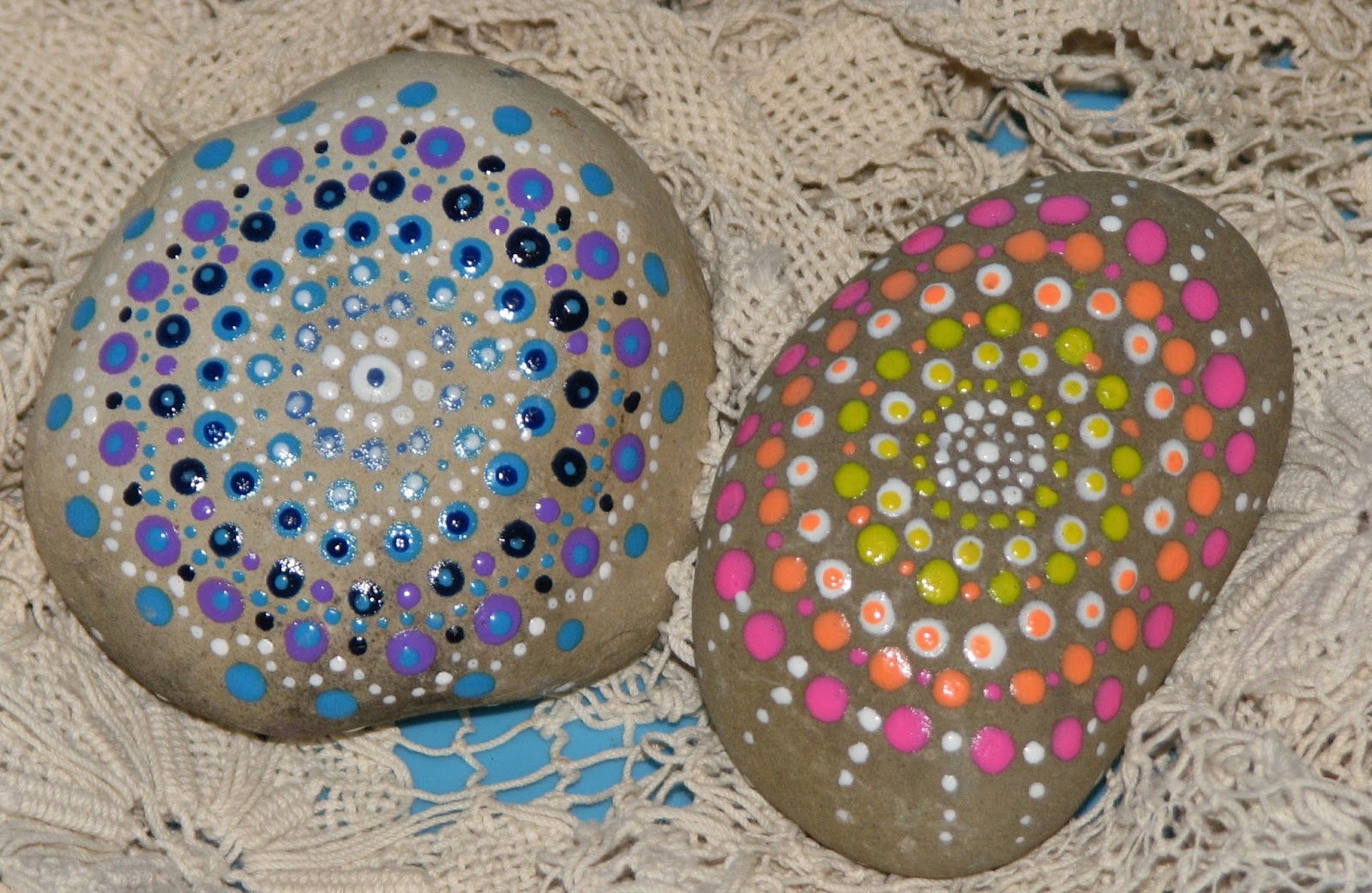
These are SOOOOOOO much fun to make, once I finished the front of the rocks, 


I flipped them over and played on the back too!

I made these Dot Rocks by using various colors of IMAGINE Crafts Pico Embellishers.  They have a very fine needle nose tip applicator that allows you to make teeny tiny dots to virtually any size you want.  I worked on 2 rocks at the same time.  The Pico Embellisher medium dries very quickly so while one rock was drying I dotted up the second and kept alternating between the two...until I ran out of room.

These rocks really are very zen when you're working on them.  You just start dotting away and the time just flies.  The best part is that you don't need any special tools, just a rock, Pico Embellishers and time.  

We don't have many flat smooth rocks like this around here so Santa brought me these two from southern Indiana...Yes, I got rocks in my stocking last year for Christmas and was thrilled! Everyone else looked at me like I was crazy.  I need to find more because these are too much fun to make.  I have so many ideas but alas no more rocks.  I even tried to order some from some place out west...never did hear back from them - they probably thought I was nuts too ;)  LOL!!  Oh well, that's going to be my mission this summer...smooth flat rocks!


Sunday, March 27, 2016

Happy Easter!

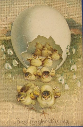
These are a few vintage Easter postcards from my collection.   
Most are from the 1890's - the last 2 are from 1908.

Enjoy!


Friday, March 25, 2016

Distress Crayon's - Part 2 & GiveAway!

NOTE - I have added additional information at the bottom to answer a few questions I have been getting...

O.k. so I decided to see what the Distress Crayons looked like side by side with Gelatos and Prima's Oil Pastels.


First, let's take a look at what you get with each of the mediums...  As you can see even though the Distress Crayon is about twice the size of a Gelato stick the contents are about the same with the Distress Crayon being a about 1/4" longer.  These two products probably have the same amount of medium because the Gelato stick is actually a bit thicker in diameter than the DC.  The Prima crayon has probably 2-3 times more medium as it's not only longer but has a much thicker diameter as well.

Price wise -

Prima's Water Soluable Oil Pastels - $15.00-20.00 for 24 crayons = $0.63 - 0.83 each

Gelato Sticks (regular size) - sets vary greatly depending on set size and extras. Generally you can get a set of 4 for 7.00 = $1.75 each

Distress Crayons - $11.00-15.00 for set of 6 =  $1.83 - 2.50 each


So, I did a side by side of Gelato, Distress Crayons and Primas Water Soluble Oil Pastels on plain regular cardstock.  I chose this substrate because let's be honest, most people aren't going to take the time to gesso a piece of cardstock for every card they want to make.

So, I scribbled a 3" long line with each of the mediums - I smudged the bottom portion with my finger tip.  As you can see the Primas smudged away to the point you couldn't see the initial markings, smudged Gelatos didn't do quite as well but - you can tell it's a bit darker where the initial scribbles were but it did disperse very well.  Distress Crayons on the other hand were more difficult to diffuse - they just don't glide over the paper much and all of the lines still show up.

Next I went in with a water brush and tried to move the mediums around that way. Gelato's and Primas were very water friendly and could easily be spread over a very large area.  Great for watercoloring if you chose to do so as they dissolved quite easily.  Distress Crayons on the other hand were difficult to dissolve and didn't have much travel, you could in fact still see all of the initial markings which no matter how much I tried I couldn't diffuse on this or any other attempts.

Since that wasn't working so well I decided to try a "removal" technique - basically just color a piece of cardstock with the various mediums, over lay a stencil and use a baby wipe to remove the color medium.


First up I tried the Distress Crayons - as you can see I had a difficult time smudging out the crayon.  The original scribble lines don't go away and I really couldn't blend the colors much either.  


I placed the stencil over the panel and tried to remove the medium with a baby wipe.  I had a difficult time with this.  I just couldn't pick up the color much at all - in the end I basically rubbed the top layer of paper away trying to get the color up.  (see below).


I ended up pilling the paper instead of removing the color...not the look I was going for.


Next up Gelatos - scribbled, blended and removed without much problem.


Finally Prima's - WOW, I used the same amount of medium as the other two examples but had far more medium than was necessary.  It blended so nicely and I could have moved it over a much larger area than I had room on my panel which is why some areas are still so dark with pigment.  A little bit of this stuff goes a very long way!  So then I placed the stencil on the panel and easily removed the color with a baby wipe.  This took almost no effort whatsoever.  The results were amazing.


Here are all three side by side.  You can see the startling difference for yourself.  I had planned on trying a few more technique comparisons but decided that I had seen enough.  I don't know about you but I don't want to have to fight a medium to get it to work.

***Edited to add - a couple people have mentioned that in some of the Distress Crayon videos they make the colors/techniques look amazing...Why don't they look like that here?

Here are a few things to think about/look for - if you look at many of the demos people share if you really look when they run a waterbrush over them - they get the same look but they don't focus on it for long.  They just swish the water over the medium then move on.  In most of the videos I've seen of the Distress Crayons when you color directly on an uncoated (no gesso or collage medium) paper/cardstock/etc. some of the color moves around (as it does in the above examples and again below) but you'll be left with a darker stain where the medium was originally applied.


So I colored an area that has solid color and a heavy coat as advised - 


I then went over it to blend it out with a waterbrush.  While there is color movement you still end up with the darker stain of color where the original DC was originally applied with a much lighter wash surrounding it.


It is stated right in the demos that you have to use LOTS of product to get the intended look - I find that this is far more product than what you would normally apply with Gelatos or especially the Prima pastels (a little goes a very long way).  In this example I colored a large block of color with a thick layer of medium and smeared it around with my finger.    The black lines outline where the original product was applied.


Next I overlapped two colors to blend - both solid coats with heavy layers of medium.


Smudged it together with my finger tip and this is the result.  The black lines show where the colors were originally colored and where they overlapped.

To get the really vibrant mixed colors the Distress Crayons were applied on a coated surface (coated with something like gesso, a collage medium, or other sealed surface) then mixed but if you notice most of the time the demonstrator either adds additional layers of Distress Crayon or another Distress product to enhance the results.  Many of the examples you see are not just a single layer of color as shown here.

I'm not saying these crayons are good or bad, that is for you to decide. I'm just showing what this particular medium looks like in a few real life tests/comparisons.  I don't get paid for this and I buy the product with my own money.  Again, I'm not the judge here, just showing you what it looks like IRL.

So there you go...
the choice is yours to make.

Give-Away Time

Would you like to try the Distress Crayons for yourselves?  If so, please post below. (be sure I have some way to contact you)

I have 6 sets (2 of each set) to give away - please note that 3 of the sets were used to make the examples so while they aren't brand new there is still lots of life in them to experiment and play with. You have until April 2nd to post a comment to be eligible for a set.  If there are more than 6 people that would like to try them I will draw names at random using Random.org.

Deep Red Stamps Winner!!

The winner of the Deep Red Stamps is....

My Fave out of these two is the garden door so sweet looking
thanks for the chance to win these stunning stamps :) hugs Nikki C

Congratulations Nikki!
Please e-mail me your addy so I can drop your stamps in the mail.

Thursday, March 24, 2016

Distress Crayons - Part 1

Hey everybody - I hope you've had a wonderful week so far.  I've had LOADS of people e-mailing asking if I've tried or if I was going to do a review of the new Distress Crayons.  Well I finally have some so here you go -

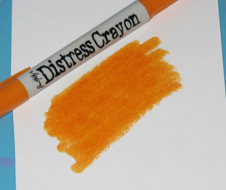
If you've not seen them before here's what they say: " Distress Crayons - Water-Reactive Pigments. DC's are formulated to achieve vibrant coloring effects on porous surfaces for mixed media.  The smooth water-reactive pigments are ideal for creating brilliant backgrounds, watercoloring, and more.  Color directly on to surface and blend with water.  Layer with Distress Inks or Stains for more possibilities."

They range anywhere from $10-15.00 for a set of 6 crayons.  At this time there are 3 sets of 6 available.  

O.k. so I thought I'd start off by just testing them on a few different types of paper to see how they react.


First I tested it on a common plain cardstock (Neenah Index cardstock) to see how it reacted.  I just scribbled on 3 (approx.) 1" squares - the first I smudged with my finger, the center I left untouched (more on that later) and the third I tried to "watercolor" with a brush and water.  As you can see the smudged example is pretty but frankly the pigment doesn't go very far.  I'm not impressed at all when you try to move it with the water.  


I left the center as a test - I wanted to see how long it would take for it to dry if left untouched.  I colored these at 9:00pm last night then this morning at around 9:00a.m. I rubbed my finger over it.  You can see that it still smudges and smears.  I tried it again shortly before posting this (1:58 p.m.) and it still smudges a bit.  So I'd say it takes a good 24 hours to dry if using it straight w/o doing anything else to it.


Next I tried it on Ranger's WC paper.  Again, smudged it looks pretty cool.  This time for the watercolor I used a Niji waterbrush - thinking that might make some sort of difference.  Nope, still leaves the original mark highly visible.


It still smudged on the watercolor paper after 12 hours as well (and at 2:00p.m.).  


So then I tried it on a gessoed surface because I've heard it works best on this type of surface.  So I prepared a piece of cardstock with a smooth coat of Gesso and a rough textured coat.  Going on I like the rough coat much better.


LOVE how it looks smudged on the rough coat - not so much on the smooth coat.  It looses it's color a bit but it did go much further as opposed to plain cardstock or watercolor paper.  I then tried to watercolor it with a waterbrush.  Again, (to me) it looked better on the rough coat but that may be because more of the medium was left behind in the crevices so there was more color to begin with.


After the watercoloring had a chance to dry it's not very impressive on the smooth at all.  It's difficult to get a nice smooth looking color.  Love the rough coat though.  Again, tried to smudge the two spots of color that were left untouched - 12 hours - still smudged, 18 hours - still smudged. 


There is a set that has neutral colors including Antique Linen (light brown) and Picket Fence (white).  I thought it would be interesting to see what they looked like on black cardstock.  This is the Black from the Distress Cardstock set.  It's weird - the white almost disappears when both smudged and watercolored.  I don't know where it goes but you loose most if not all of the color.  The Antique Linen is a bit better - but it's not a nice look once the watercolor has dried.


I must say it goes on smooth, VERY smooth - like warm butter or lipstick that's set in a hot car on a summers day.   I'm thinkin' that may be a good thing or it may be a bad thing.  I used the green to color the 6 - 1" squares and it used over 1/2 the tip.  I'm guessing that you'd go through a color pretty quickly if you were working on a very big piece.

Tomorrow I'm going to be sharing how it preforms next to Gelatos and Prima's Oil Pastels.  If you'd like me to test it out on something specific, please let me know.  If I am able I will most certainly do so.

Wednesday, March 23, 2016

Tags or Lace? Club Scrap Artist Challenge

This month's Club Scrap Kit - Paris Flea Market included a set of Lace Paper Mats as well as a sheet of White Die Cut Tags.  The challenge for the Artist Team was to use one or the other and incorporate them into our creations 3 different ways.

The lace paper mats were of course VERY popular so I decided to be different and incorporate the die-cut tags in my cards.


My first card was pretty straight forward.  I used washi tape for the background; stamped the sentiment onto one of the die-cuts and added a bit of faux stitching around the edge.


There was a really LONG die cut tag included on the sheet which I thought would make a fun drop focal point.  I snipped off one of the pointy ends, cut a grey mat which I stamped & mounted on the extra long tag.  It was then adhered over a stamped pink background panel.  A second tag was used to stamp the sentiment which is being "hugged" by a die-cut flourish.


Finally there were these cool die-cuts that had perforations in the center - fold them over and wow, looked like a great way to hold a card closed!  I stamped on the fronts of each of the folded tags, mounted them on each side of my card and strung a ribbon through it.


It opens up to reveal a pretty Paris collage - lift it up and you have a nice place for a note.


Those were my 3 cards I created for the challenge but I have an extra for you.  These darling tiny little black tags were included in the kit as well.  I figured since I was on a tag kick I might as well keep going right?  So I inked up the large Paris Flea Market collage stamp with white ink, placed each tag on a different area to create this fun and cool design.

Trying for a somewhat clean and simple design I kept it pretty simple, just dangled each tag on the card with a bit of twine (which I just happened to have the perfect matching colors!!) and added a little stamped sentiment from the Celebrate kit (January).  

That's all I have for you
except....

Tag - You're it! 
(Sorry, couldn't resist.)

It's time to hop on over to see what
has created to inspire you.

The entire list of participants can be found on the 


Supplies:
ClubScrap.com -  Cardstock, Pattern Paper, Die-Cut Tags, Stamps, Brads, Ribbon, White Pigment Ink, Ash, Carnation Hybrid Inks
Imagine Crafts - StazOn - Spiced Chai, Cloudy Grey, Jet Black
Other Supplies:
Twine, Die-Cuts, Flower, Washi Tape

Tuesday, March 22, 2016

Easter Watercolor Wreath Card

Hey there everyone - can you believe that Easter is this weekend already?  Gosh, it seems like we were just celebrating New Year's and it's already (almost) official baseball season!  Unbelievable!

So, I have been messing around more with watercoloring and thought I'd share a little card I made using my Kuretake watercolors....


The wreath is just dots and splashes of color...just started adding colors layer after layer.  While one area dried I worked on another area.  When it was finished I dabbed a couple different colors of purple around the outside.  Once it had dried I stamped the sentiment in the center.


Oh and I did add a bit of glitter here and there just for an extra bit of sparkle.

So, what do you think?


Monday, March 21, 2016

Paris Flea Market - Guest Artist Cards - Club Scrap

This month I was lucky enough to be selected to be the Greetings to Go Guest Artist over at Club Scrap for March's kit - Paris Flea Market.  I have been asking for this kit a couple years now because I just knew it would be amazing.  I was thrilled to find out it was going to be this month's kit.  

You can find all of my cards here - 


I really wanted to do this kit justice so I put my all into them.  I tried to give each card something extra special so it's either got a fancy fold, die-cuts or just something that makes them stand out. I made 12 cards in total but I thought I would share some of my favorite cards with you here...


Hope you enjoy them and pop on over to Club Scrap to see the rest.

I will be making a few step by steps on some of the cards and simple directions for the rest very soon.

Have a wonderful day friends!


Friday, March 18, 2016

Faux Cloisonne'

It's Friday!!! 

Today I wanted to share a fun technique for creating faux Cloisonne'!  I was recently inspired by an Antiques Roadshow that featured a cloisonne piece...the colors were so amazing, it looked like it was lit from within.


The secret behind this technique - the combination of aluminum foil (backing) paired with StazOn Studio Glaze!  It gives that same "lit from within" look on paper.  Make your cards shine with this lovely technique.

For complete details, please see the following post on the Imagine Crafts Blog -


Have a wonderful weekend everyone!!