Thursday, September 25, 2014

Altered Playing Cards - Week 3 - first half

Hi All!

As you know last week was a mad house here so I'm already behind on the Altered Playing cards and it's only week #4- LOL!!  

Sooo, this afternoon after work I started on the first half of week #3.  Claudine's playing card was made using Alcohol inks with a Steampunk theme.  (whoo hooo!!)


So I started off with Alcohol Inks too!  I used a couple different colors of blue on an old flash card (remember, I'm not using playing cards...I'm using flash cards & bingo cards).


Once it was covered I added a layer of Gold then a layer of Copper. 


Finally I took a felt soaked with Blending Solution and pounced over the entire card.  It ends up looking like a hammered metal.  (looks even better in person!)


Next I glued down a gear die-cut (Memory Box) on the card and pounced the felt I had soaked with Blending Solution over the entire die-cut.  This had picked up just enough of the AI to color the die-cut.


I then applied a layer of Crystal Lacquer over the entire card.  This will both seal the gears to the card and it will really accentuate the metal look of the AI's.


You'll need to let this layer dry completely but it looks awesome already huh?  Don't try to speed drying with a heat tool...the CL will bubble and that's not the look we're going for with this card.  I want to keep the sleek, smooth look of metal.


Once the CL had dried I applied Black StazOn to the edges.


and stamped a few Steampunk images/words...


Now for some extras ~ I stamped my sentiment (Genius is 1% inspiration and 99% perspiration.)  and my Steampunk Guy Eyes.  All of the stamps used are from the Steampunk sheet from Artistic Outpost.


I colored the eyes with a variety of inks and added silver pen work for the glasses frame.  He was then cut out and matted as was the sentiment.


I decided the card needed something so I used my Bronze irRESISTible Texture Spray and flicked dots onto the card.  It was just what I was looking for.


And after it dried...I mounted my image & sentiment....


I love it! 
It's so very me :)

Tomorrow I'll be back with the second half of week 3...hopefully I'll have time to work on Week 4 over the weekend so I can get caught up with Week #5 next week!  


Wednesday, September 24, 2014

Blueprint Club Scrap Blog Hop - Gate Fold Home Album

Happy Wednesday Everyone!

Today is Club Scraps September Blog Hop celebrating the Blueprint kit!  I have to say I love the theme of this kit - it is so much fun and the colors are spectacular.


I actually had so many ideas running through my head for this kit I had a really hard time trying to decide what to make.  Well, at the last minute (yesterday) I finally had to make a choice.  I decided upon a "house" gate fold/bi-fold album.

Here is how I went about constructing it....


and here is how it turned out....  I left the area above the doors blank because I thought it would be nice to add a family name there.


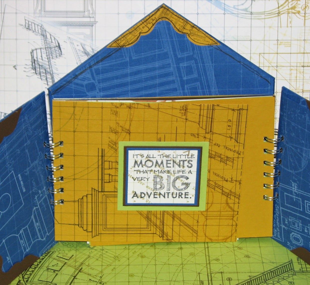
and here it is with the doors open to the first page.  The rest of the inside pages are just waiting to be filled up with love from one lucky reader!  Simply leave a comment and you'll be entered to win my house album.  It's up to you to turn this house into a home.


And I couldn't forget our little gnome friend...
he was feeling a bit blue so he got out the paint and had a wicked good time!


It's time to hop on over to


for more inspiration.  If you get lost along the way 
you can find the complete list on the 


Have a wonderful day everyone!
You have until 9-30-14 to post a comment to be entered to win the house/home album!
Good Luck and stay inky!

Tuesday, September 23, 2014

Gate Fold House Album - Club Scrap

It's hard to belive but tomorrow is the monthly Club Scrap Blog Hop.  I don't know where the month has gone but it's simply flying by!  This months kit is Blueprints...


Such a lovely kit...the colors are even better in person!  Today I wanted to share the instructions for the base of my project that I have created but I'm trying something new.  I made a "how to" guide on Snapguide.  I hope it works!


You'll have to come back tomorrow to see how I finished the album off!
Till then...
PLMK what you think ~
of the album and guide.

Monday, September 22, 2014

Autumn Cards - Crinkle PanPastels Background

Hi All!

Well I survived the yard sale!  It was 5 days (2 setting up, 3 days of the sale) of non-stop busy...we all did pretty good on sales and we lucked out ~ the rain held off until after everything was packed back up.  We even had time to take down the canopies and get them put away as well.  

Today we dropped off the left-overs to a community church which is having their annual charity garage sale this weekend.  I am so happy!  We made some cash, soon to be DIL & I got to spend lots of time together and Mom was able to join us on Saturday... a great time.

Well, I finally got to make some Autumn cards from the background paper I made using the PanPastel Crinkle technique I shared last week.... (click to enlarge for detail)

Stamps: Leaf - Just For Fun Rubber Stamps; Sentiment - Paper Smooches


I really love this technique - I know it doesn't show up very well in the photographs but by using multiple colors of the PanPastel for the various "Crinkle" layers it adds such depth.  So much fun!

Wednesday, September 17, 2014

PanPastels - Fair well to Summer

Well, I didn't get my Autumn cards made using the crinkle technique I shared earlier this week as you must have noticed.  We had to work late yesterday and today....I was setting up for a garage sale!!  I know, I said I wasn't going to have another but well, you know how it goes...after a while you forget the pain and think it's a good idea again.  My soon to be daughter in law and I are having it out at my Mom's - she had a great location...right off a main road.  Luckily the town harvest fest is going on this weekend too so we're hoping for lots of traffic.   So I'm not going to be able to post much in the next couple days but I did want to share a fun project I made using the PanPastels again.   I know, another PP project but you know how it is when you get a new goodie...you just gotta play, play, play!

Here is my, "Fair well to Summer" project.  The image started out as a black piece of cardstock.  The lighthouse is an Altered Pages collage image.  For more info about how I made it be sure to check out my post on Altered Pages - Fair Well to Summer.  


Hope you all have a great week...I'll try to pop in and let you know how the sale is going.  If I don't have time I'll see you on Monday!  Till then...stay crafty :)

Monday, September 15, 2014

PanPastel Crinkle Technique

I have been experimenting with my PanPastels and I am so in love.  Today I wanted to share a fun technique that is an oldie but the PanPastels kick it up a couple notches.  First, let me start off by telling you that this works with regular pastels but the colors won't be as vivid as they are with PanPastels so if you have scrapbook chalks or pastels be sure to give it a try.  It's lots of fun and very addictive once you start playing with color. 

Supplies:

Pastels & sponge
VersaMark Ink
Cardstock
Plastic Wrap (or similar)
Fixative (hairspray or art fixative)


Basic Crinkle Technique -

1. The basic crinkle technique is so fun and easy.  First choose 2-3 colors of pastels you'd like to use for your design.  Even though it's still officially Summer here it feels like Autumn so I'm using the metallic PanPastels for that fall look.

2. Next wad up the plastic wrap or plastic packaging.  I'm using a plastic wrapper that came off of a stencil I bought quite some time ago (I never throw packaging away....you never know when it will come in handy!).  


3. Dab it on the VersaMark pad.


4. Begin pouncing the inky plastic wrap onto your cardstock.   You will need to re-ink the plastic wrap after a few pounces on the cardstock.  It's o.k. if it's not perfect coverage - we'll fix that in later steps.

TIP: For a pattern paper look pounce the plastic wrap in a line or in one direction to create a repetitive design.  For a more organic look pounce the plastic wrap on the cardstock then shift the cardstock or the plastic wrap in a different direction each time you pounce.  This helps keep the look random and natural.


5. Use a sponge to pick up the pastel and begin gently dabbing it over the wet (invisible) ink.


Your design will magically appear!  Continue applying pastel until the entire piece has been covered with pastels.


6. It's time to apply your next layer of VersaMark ink.  It will be easier to determine where your ink needs to be pounced since you have a layer of PanPastels to guide you.


7. Dab on your next color of pastel over the ink.


8. If desired repeat with a third color of pastel or use as is.  Once you have finished adding color, apply a layer of fixative to set the pastels.

Color Crinkle Technique

Since the PanPastels are so lushious and "creamy" they blend beautifully so I thought it would be fun to try the Crinkle Technique over a blended background.  I think it worked perfectly...check it out ~

1. Choose 2-3 colors of pastels for your initial layer.  Since the pastels naturally darken when paired with the VersaMark ink it's o.k. if you use dark colors for your base layer of color.  Pretty much anything goes with this technique.

2.  Begin applying your base coat of color to the cardstock.  I am again using Autumn colors to play with for this example. 


These pastels blend seamlessly because they are so finely ground.  It really is almost like using a paint instead of pastel.  

NOTE: Yes, those are my fingerprints along the bottom edge of the piece...I intentionally made this cardstock larger than what I needed for this very reason.  Keep in mind the pastels will cling to oils on your skin just as they cling to the VersaMark ink.  If you're messy like me you'll need to leave a little extra room on your cardstock.


3. Apply a fixative to the base layer of color.


If you're like me  you can speed drying a bit with your heat tool.


5.  It's time to proceed with the Basic Crinkle Technique - wad up the plastic wrap, dab on the VersaMark ink pad and pounce on the colored background.   Apply your first layer of color over the VersaMark.  Don't worry about the base coat of color....it will be safe because we applied the fixative.


6. Continue to apply one or two more layers of VersaMark ink and Pastels as desired.


And here's how each technique turned out....


The great thing about this technique is that the results are never the same and always a surprise.  It's so much fun to experiment with color combos with both the Basic & Color Crinkle Techniques.   I'll be back tomorrow with some finished cards using these two examples.  Hope to see you then!

Friday, September 12, 2014

APC Challenge Week #2 - Card 2

Woo hoo...got home early and got to finish my second card!  I'm so excited about this one.  If you recall I shared the first card yesterday....


and here is how I left the second card....


Claudine's card held the sentiment "Expand your wings, learn new things and fly".  To me that intimated a journey so I went that route.  Her card also had a fairy on it but I don't have any fairy stamps that are really my style so I improvised!  I think the figure I used paired nicely with the sentiment I chose to use....

I started off by stamping an interesting texture stamp on the background with Peanut Brittle Luxe ink.  The nice thing about this ink is that it stays wet long enough that I was able to dab on copper & gold PanPastels for a beautiful shimmer effect.  I added some "travel" themed washi tape and a nifty compass die-cut from Susana's Custom Art & Card Design.  


Next I stamped Alice on white cardstock, colored with spectrum noir colored pencils and fussy cut her.


I added the pointing finger washi tape, the sentiment and stamped a compass in the corner.  The sentiment says, "Where ever you go.... Go with all your heart."

Stamps - Background Texture - Just For Fun Rubber Stamps
Alice & Compass - Deep Red Stamps
Sentiment Font  - Ornatique


and here they are both together....


I had lots of fun making these...I can't wait to see what is to come!

Thursday, September 11, 2014

Altered Playing Card Challenge - Week #2

Hi all... Last week I mentioned that I had decided to join in a fun challenge - Altered Playing Card Challenge.  So the first week was to choose your deck of playing cards and cover them with a layer of gesso.  Well, you know me - I like to do my own thing so I pulled together a set of more unusual cards....


Yes, I went to my stash and pulled out bingo cards, flash cards, coasters and even a few giant playing cards.  I'm going to have a mega stack of art cards when I'm finished!  Now about the gesso'ing - I didn't do that either.   I personally like the foundation to show through on some cards more than others which is why I left them bare. Since I don't know what the supplies/techniques will be I decided to leave them as is and decide at the time if I want to add gesso or not.   This week since the assignment was to use spray ink I did apply gesso - more on the coaster, less on the bingo card.


For the coaster I decided to add some texture by "Cooking the Gesso".... I began heating the gesso when it was about 60% dry.  Why then?  The gesso was dry enough to form a skin over the entire piece - thinner areas completely dry while the thicker peaks were still very wet inside.  Now what do I mean by cooking it...just that, heating the gesso until it started to boil and bubble and form lots of great texture!  


You can see some of that fun texture in this photo....


Now time for Week #2 - as I mentioned above Claudine used spray ink so I pulled a few out.  Bubble Gum Pink and Squeezed Orange for my first card...


And London Blue & Fresh Lime for my second...


Here are what both of my cards look like at this point.


I wanted my cards to be similar but not exact so I kept the butterfly theme, stamped my black flowers instead of using a die-cut and found a sentiment that I liked and here's how it turned out!

Stamp: Just For Fun Rubber Stamps
Fonts - "just don't fly" is Modern No.20; Soar is Ornatique
Die-cuts - no idea - sorry!

I got home from work later than planned so I didn't have time to start on the second card so I'll have to share that one tomorrow...once it's finished that is.

Hope to see you then...

Wednesday, September 10, 2014

PanPastel - The Kiss Canvas

I was again inspired by the Reader Art Request over at Unruly Paper Arts...  This month the theme is "The Dark of Night" and check out the inspiration photo & colors....


Be still my heart...look at the lovely blues!!!!  Now how could I not make something for this challenge.   Since my PanPastels have been sitting on my desk begging to be played with I decided to pull out the matching colors and begin to play.  I was very inspired by the photo and had something in mind immediately.  I was so into the project that I totally forgot to take photos in the process.

Here is what the canvas looked like with the first layer of PanPastels - I used various blues, grey, black and the Fine Black and White sparklie pastels.  I then sprayed a layer of hairspray over the entire canvas to seal this initial layer of pastel.


Next I stamped several tree images with embossing ink and sprinkled on black embossing powder.  I heated to melt.  Once it had cooled I "painted" embossing ink along the edge of the lake, near the woods on the hill, in the lake and around the edges.  After those areas were embossed with the black E.P. I added more shadows and highlights to the trees, clouds, lake and the kissing couple.  One final layer of hairspray and I'm calling it done!


There you have it...my rendition of The Dark of Night!