Thursday, January 28, 2016

2016 Watercolor Calendar - June

We're just zingin' along on the calendar - today we're 1/2 way there and have I got some fun for you!  Today we're going to paint a watercolor meadow.


And here's my calendar page!


Obviously this isn't my calendar page - it's the example I made for photos.   My calendar is still drying so I'll be sharing that a bit later today.


Today I'll be using a fan bristle brush.  It's not mandatory as you could make grass with a fine brush but a fan brush will make it go much quicker and easier.   You can however make one rather than go out and buy one!  You'll need a fairly large size round brush - a 4 or 6 will work great.  I put down a piece of washi tape on my work surface.  Position the paint brush over the tape and spread the bristles of the brush in a fan pattern as shown.


Once satisfied with the position of the bristles I took a bit of Crystal Lacquer and glued the bristles in place.  The CL dries quickly so it's just a short wait time for the brush to dry.  Once it's dry you can remove it from the washi tape and you're ready to go!


Now we're ready to get started...  I dabbed on a bit of masking fluid here and there - no real set shape, just small dabs which will later become my (fried egg flowers) daisies.


Begin painting by adding a wash of diluted blue for the sky and very diluted green for the ground.


Tear a strip of watercolor paper and place it over the grass area where you would like to begin.  Pick up a bit of green paint on the tips of the fan brush.  Starting on the scrap of torn paper, flick upwards in various directions to create grass.  I used a couple colors of green and a bit of yellow for the grass. Re-position the scrap of paper and add more grass until you have created a meadow.


This is what it looks like at this point.  I should have added here a bit of diluted brown here and there for the ground. I added it later which still works, it's just easier to do so now before you begin adding the flowers.


Now begin adding the flowers.  I started by adding dots of yellow...


Then I brought in red...  no real design, just little squiggles of color.


Next I made a few delphiniums with purples.
You will note that I also added black dots on each of the red flowers - now poppies.


A few dots of blue here and there, a second layer of color on the delphiniums.


I painted on stems and leaves on a few of the flowers that needed it.


Once that layer had dried I peeled off the masking fluid and went to work on the daisies...


which actually look like fried eggs to me.


My calendar page...


And all of the examples made for this page - the experimental test flowers, the "in the process" example (which will be used for a card) and the finished calendar page.

So there you go...pat yourself on the back
we have 1/2 the year finished.

Wednesday, January 27, 2016

Celebrate! Club Scrap Blog Hop

Welcome friends - it's time to Celebrate!
Celebrate with the 200th Club Scrap Kit that is!

This kit - Celebrate - was so much fun, filled with lots of bright colors and cool patterns. While I was thinking about projects to make using this kit I was inspired by Karen and this months Technique Challenge on the Club Scrap Blog - Origami Folded Elements. I knew right away I wanted to make a mini album so I put on my thinking cap and decided upon a Squash Book Album...no, not the fruit (did you know squash was considered a fruit?)...the origami folded variety.


I used the black circle/mandala print for the covers of the book and the sentiment from the Unmounted Stamp sheet is perfect. 


I decided that instead of the usual 4x4 or 3x3 book I would go with full 12x12" sheets which when fully opened makes this book about 33-34" across!  It's a whopper with lots of room for all sorts of photos and journaling.  


I love the black/silver flourish print...it was the perfect accent for the bright turquoise and orange cardstock.  The two white triangles actually have grey text over the entire page but it just didn't show up in the photo.


Flip the open book up and you've got even more room to embellish.  I wanted a little something different on the back so I stamped my own flourish print using stamps from the UM and Art Nouveau stamps sheets and Silver Delicata ink from IMAGINE Crafts. The grey triangles were also stamped with circle images from the kit paired with Club Scrap Ash ink. I left the orange print show through because it was just too pretty to cover up!

Give-Away Time!!

All folded up this book measures 6.5" square.  A really nice size to hold lots of memories and to share which is what I'd like to do with this album!  Simply leave a comment about what your favorite part of the kit is or what event you'd like to use this album for and you'll be entered to win!

You have until February 1st to post your comment to be entered to win!

And NOW....

A special
Happy Birthday
goes out today to Club Scrap Julie (a.k.a. Cape Cod Scrapper)!!
Hope you have a wonderful day Julie!!

and it's time to hop on over to

Juilie's Blog - Cape Cod Scrapper

to check out her creation for the Celebrate Kit....
Be sure to wish her a Happy Birthday while you're there!

If you get lost along the way the complete hop list can be found here:

Club Scrap Celebrate Blog Hop

Have a wonderfully inky day friends!

Tuesday, January 26, 2016

CHA - More New Stuff?!?!

Well CHA has been over for a bit now and I was wondering if you saw anything in the maze of new products that you had to have?  If you haven't had a chance to check it out, here is a list to get you going....


or if you'd like to watch a few videos check this out....


I don't know about you but I'm a bit overwhelmed by it all.  I guess I'm just getting a bit jaded by all of the sales pitches and so called "NEW" stuff out there.  (And by stuff I mean tools and the like - I'm not referring to paper, embellishments or stamps.) It seems like if you come up with a new name for an old product it's still "NEW"....   I saw several "NEW" products that are just copies of something from another company.  I understand manufactures wanting a bigger piece of the pie but seriously how many ways can a canvas be anything other than a canvas or a shadow box be something different?

I also noticed how expensive some things are getting to be...for example the MISTI - I heard there was a new mini version out.  Well, the original larger size started out at $70.00 which I thought was really expensive for a tool that only did one thing AND that had lots of durability issues.  So I thought if it's smaller it's got to be cheaper right?  NOOOOO - the mini is $85.00!  I though what the heck - so I checked - the original larger size is now $120.00!  Whew - when I see that all I can think about is how much ink, stamps, watercolor paper, or other color mediums I can buy for the same $'s.  I'm sure it's a great product (if they've gotten the cracking issue taken care of) but man...I just can't justify the price.

NOTE: My Sweet Petunia has the mini for 45.00 and the large for 60.00 - much more reasonable - now it's back on my "to buy" list - LOL!!

I guess it's the same with stamping techniques though...I keep hearing about "NEW" techniques which are really just old techniques with a new name.  For example resist techniques - yes, you can use different mediums to resist other mediums but it's still a resist technique.  Or if you press one stamp into another inked stamp it's still the kiss technique no matter what you call it.

What are your thoughts about all the "NEW" stuff out there?  

Monday, January 25, 2016

2016 Watercolor Calendar - May

We're up to May in our watercolor calendar and today I have a bit of mixed media going on.  Don't worry if you don't have the exact same supplies...use what you have :)


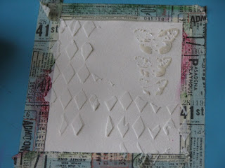
I wanted to create depth and texture prior to adding the color medium because when you do so you get some really cool pooling of color around the texture.  I used both Creative Medium from IMAGINE Crafts and Modeling Paste by DecoArt Media.  You could also use gesso in place of either.


For this example I taped the piece down...sometimes I prefer to leave it loose so I can manipulate the water/color medium by lifting it up and tilting here and there. 


Apply the gesso, Creative Medium, and/or modeling paste over some of your favorite stencils.  Both of these are The Crafter's Workshop.  Let your chosen medium dry. 


For my watercolor today I decided to use Magenta's Nuance powders but you could also use Color Burst, Bister or Brushos as well.  If you don't have a powdered watercolor medium you could achieve a similar effect with watercolor paints and a brush. You would do so by flooding your paper with water; load up your brush with lots of color and float it around the page as desired.  You can add one or more color but be sure not to go overboard and create mud.


Once it has dried you can remove the tape.


I added a bit of detail by adding a bit of ink through a stencil here and there over the panel.


The calendar page was made in the same way.


I ended up using 4 Nuance colors for the calendar page since it was larger.


A bit of text...


And for this example I added a touch of DecoArt's silver Metallics paint to the harlequin.


Don't forget to use a few tags to sop up the excess watercolor medium.


Are you enjoying this calendar so far? 
I know I am having fun making it...hope you are too.

Sunday, January 24, 2016

Pocket Letter Swap - Details Sent!!!

Hello all you Pocket Letter players....  Just a note to let you know that all of the addresses have been sent!  You should have an e-mail with the person you will be sending your PL to!

PLMK if you didn't get it or if you have any questions, problems.  I'm here to help with anything I can!

Thanks so much for joining in on the fun!!

Friday, January 22, 2016

Ink Stains Pocket Letter Swap - Last Day To Sign Up!

Today is the last day to sign up for Ink Stains Pocket Letter Swap!  If you've been thinking about joining now is the time to do so.  Sign ups will close this evening at 6pm.  If you would like to join you can sign up by posting a comment here: Pocket Letter Page Swap.

As soon as I have all of the information from each player I will be sending out your randomly chosen destination.  It will go out sometime this weekend but I'll post here to let you know once the e-mails have been sent.

Have fun creating - 
I can't wait to see what everyone comes up with!

Club Scrap Artist Team Celebrate the Circle Challenge


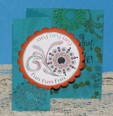
This month the Celebrate kit features many lovely designs featuring circles so the challenge for the artist team members was to create projects incorporating circles.  Celebrate is so bright and cherry, to me this kit screams birthday so I decided to make a trio of birthday cards all centered around circles!


For my first card I decide to play a little bit and make a telescoping card....


Woo Hooo...let's party!!!  
A bit of stamping, a few brads and glitter!
And don't forget the crown for the birthday guy or gal.


Next I wanted to share the lovely print on the turquoise paper...
color a few of the dots, a couple stamped images and of course more bling
and you're got a great start to a celebration.


And finally a little stand up card with a surprise in side....


A bottle cap with birthday wishes and a couple of fun glittery stars
for the star of the day!

As you can see, I had lots of fun with circles...and glitter!
Be sure to check out what all of the other Artist Team members 
created for your viewing pleasure...
the next stop on the hop is...


If you get lost along the way the complete list can be found here -


Supplies:
ClubScrap.com - paper, stamps, inks, embellishments
Spellbinders - circle & scallop circle dies
X-Cut - Circle & Scallop Circle Dies
Glitter Glue, Faux Gemstone, mini brads

Thursday, January 21, 2016

Looking for Third Coast Stamps...

I know many people out there e-mailed me and asked about what happened to Third Coast Stamps when they disappeared off the scene abruptly a couple years ago.  I felt really bad because I couldn't help anyone with the missing stamp orders, non-communication from the owners or any of the other problems that folks had when they shut down without notice.  

Well, I wanted to let you know that the same owners opened up a new store called Third Stone Stamps. I suggest if you have outstanding issues you might want to contact them here (taken from their web-site contact us page):

Third Stone Stamps
PO Box 308
Wolcott, Colorado 81655

We also have a Texas location so please contactus to see where we are before sending snail mail!

Phone: 970-370-5608Fax: 815-301-8935


Normally I wouldn't post anything like this and I know it's not the Politically Correct thing to actually speak the truth when something is unpleasant BUT I know what a huge mess it was when they just up and disappeared.  I feel awful that I was on their team at the time representing Val and the company but I was in the dark just like everyone else. Despite that fact my name and art was associated with Third Coast so many people held me responsible. I am truly sorry and apologize for any inconvenience and loss of $'s she caused.  She left many unresolved issues with both customers and DT members alike - with missing orders,  LOTS of uncompensated work, ZERO communication, lost $'s etc.  Bitter as it may be I did learn a good lesson from the whole ordeal.

Since then you may or may not have noticed that I have limited my design team work to just a few companies that are solid, honest and reliable.  I don't want to ever associate my work with companies and/or people who are less than honorable or just out to make a buck. 

Even though I love so many of the images Third Coast/Third Stone offers I can't support them this time around nor would I suggest you do so either.  I know you're supposed to turn the other cheek or let bygones be bygones BUT I also believe one should learn from past mistakes and not repeat them.  So please be forewarned and order at your own risk.

Brusho & Nuance Valentine's Day Cards

Today I wanted to share a couple of cards with you using Brusho & Nuance powders...  First up the more traditional card with pinks, reds and a bit of black thrown in....


The center heart was made using the 3 reds from the Nuance powders.

Stamps: Just For Fun Rubber Stamps
Inks: Imagine Crafts
Pattern Paper: Authentique
Pink Card Panel Paper: ClubScrap.com


A close up of the heart and the stamps used...


Next my "non-traditional" Valentine...made with my dh in mind.  He's not really a pink kind of guy so I thought he might like something with a bit more guy friendly color scheme.  I used Turquoise, Lime Green & a touch of Violet Brusho Colour Crystals.  I LOVE how it turned out...I hope he will too!


A close up of the shaker...I love how the couple shows through the vellum on the shaker.

Stamps: Just For Fun Rubber Stamps
Inks: IMAGINE Crafts
Misc - Sequin Trim, Micro Beads, Heart Sequins

Hope you all have a lovely day!

Wednesday, January 20, 2016

Prima Water Soluble Oil Pastels & Gelatos

If you recall yesterday I was talking a bit about Prima's Water Soluble Oil Pastels.   Well, last night in the middle of the night (of course) I was thinking about how they behaved and suddenly it occurred to me that I should compare them to Gelatos.  At the time when I was experimenting with them vs. the watercolor crayons and such I just couldn't figure out why they seemed familiar.  They seemed familiar because Gelatos are very similar in consistency and how they behave...or so I thought. 

So today I pulled out a couple Gelatos and the PWSOP's...


They do seem very similar but side by side the Prima's are still have a much more creamy, smooth and softer consistency.  They go on the paper (watercolor paper) easier and as you can see below blend better too.


Above wet, below dry.


I wanted to see how various other mediums looked over top of both so I used Memento Dye Ink to stamp the word love; Sharpie to write hello; drew a line across each color using a Prismacolor pencil; 123 with an alcohol marker and ABC with a pigment marker.  Both were very similar but I could tell a bit of a difference between the stamping - Prima's were a bit darker and more saturated.  When writing on the Gelato side (with most of the writing tools) that it felt like I was writing in wax, I did not get that sensation with the Prima side.

One issue I always have with Gelatos is that even after they have dried they leave a coating that can be easily rubbed off - which if it's on a one time use card is no biggie but if you're using it in a scrapbook album, art journal or planner it could become an issue very quickly.  The small piece of paper below the test colors was rubbed vigorously over both the Prima & Gelatos.  As you can see the Gelatos side easily smudged onto the scrap of paper.  I had to really work to get anything off of the Prima side.

Size Wise - Size isn't everything BUT I will tell you that you get far more medium with the Prima's than you do with the Gelatos.  Now to be honest I had never unscrewed the Gelatos all the way to see how much there actually is in the tube BUT I did today.  I used one of my new sticks that I hadn't yet used and the medium inside the tube measured 1 3/8" x 3/8"; the Primas measure 3 1/4" x 1/2".  So you're getting more than double with the Primas once you factor in length and width.

Finally the biggest difference between the Prima WSOP and Gelatos is price!  This is a very important factor (to me anyway).  I did some checking and the Prima Water Soluble Oil Pastels are priced anywhere from 13.00 - 20.00 for a package of 24 colors; the Gelatos on the other hand are approx. 7.50 - 12.00 per set of 4 colors (regular size - not the double stick).  That works out to about $45.00 and up for a set of 24. You can get a set of 36 Gelatos for around 50.00 - 60.00 if you look around.  I'm not sayin' the Gelatos isn't worth the money or anything but if you're looking for cheaper alternatives I'd say these Prima WSOP's are the way to go.  

Just FYI - both the Gelatos and Primas can be used very similarly for many techniques - they can be chopped up and mixed with various mediums (gesso, modeling paste, etc.) to create colored mediums,  they can both be colored directly onto stamps,  used as a watercolor paint directly from the tube/stick, etc.  

Tuesday, January 19, 2016

New to Me - Prima's Water Soluble Oil Pastels

Obviously I must live under a rock...albeit a lovely artsy rock I hadn't heard of Prima's Water Soluble Oil Pastels until I was browsing around Amazon over the holidays. Apparently they came out in late August of last year but I missed them somehow.   I had some bonus bucks to spend so I ordered a set.  Up until today I hadn't really had a chance to play with them much other than just scribbling them around on a card or two.

Well, today I decided to do a little investigating them because their name alone was a knob scratcher (to me).  


I am familiar with oil pastels, actually that was one of the first art mediums I was introduced to and as a matter of fact I found that very set (what was left of them) not too long ago.  The name "Water Soluble" is what initially intrigued me because traditional oil pastels are usually wet blended with a solvent of some sort...not water. 


My set was a bit worse for ware when it arrived...the box Amazon packaged them in was large enough for probably 30 sets and the little air pillows didn't do much to keep 'em safe.  While the box was in tact, the sticks were a jumble in the box.  


So I started off by just scribbling them onto plain white cardstock (Georgia Pacific).  I was thinking since it says water soluble they might be similar to watercolor crayons so I pulled those out and my trusty oil pastels.

I have to say the Prima pastels were very velvety when drawn on the paper...the medium was smooth and creamy.

The watercolor crayon was more similar to a soft watercolor pencil in the fact that the medium went down with a very even, consistent line - not nearly as creamy or as soft as the Prima.

Of course the oil pastel was very smooth and made a line something between the two.


I then put them to the water test...  (plain water & #6 round brush)

Now let me put this out there - I wasn't expecting much from the Prima (I kept going back to the name thing).  I was very pleasantly surprised!  They blended beautifully - so much so you can't even see the strokes I initially made!

The watercolor crayons blended as expected...I could still see the lines and it didn't seem to spread as rich a color as the Prima did.

As expected the true oil pastels didn't budge...


Just because I had to see it I scratched out a few lines of both the Prima and WC crayons....amazing difference don't you think?


And another test just messin' around - again on plain white cardstock.


Really beautiful results for a single line of color.


Then I did color the Prima on watercolor paper...


I used varying amounts of water just to see what the colors looked like and how they blended out.  It really is amazing how blendable they really are.  I love the feel of them when drawn on a paper (both wc & plain cs) and the colors remain vibrant and clear.

Even though the name still messes with my CDO mind because while they really aren't "oil pastels" they are an amazing color medium!  I will be back tomorrow with more on these fun new pastels.