Monday, March 31, 2014

Paper Comparison - Archival Ink

The first test I put all of the papers to was to stamp on them using Archival Ink with a variety of stamps.  I wanted to be fair so I pulled a variety of stamps to use for this initial comparison.  I used a fine line rubber stamp (flowers - Deep Red Stamps), bold rubber stamp (poison bottle - Inkadinkado); fine line acrylic/clear stamp (wonderful - Avery Elle) and a bold acrylic/clear stamp (gear - Inkadinkado) all pictured below.


Next I just inked each stamp up and stamped it on the papers just as I would any other time.  Here is what they look like....  You can click on any to make the photo larger to see the details.


Bazzill Basics Card Shoppe CS - o.k. impressions - the bold images had a grainy look to them.

Canson MM CS - Not very good impressions with the bold image stamps...paper is very rough so it made it difficult.


CC Designs - Great impressions 


Copic Xpress It - Great impressions.


Crafters Companion - Average impressions - lighter color impression compared to other papers.


Georgia Pacific - Average impressions.


HP Photo Paper - Glossy Side - Amazing impressions! All of the stamps stuck to the paper when stamped.


HP Photo Paper - Matte Side - Average impressions. Notice how much lighter the ink is than other types of paper.


JudiKins MatteKote - Great Impressions - a bit of puckering on the bold images.


La Blanche - VERY slippery - you have to be extremely careful because the cardstock is so slick.  You can see on the wonderful image where it skidded a bit when I stamped it.  All of the stamps stuck to the cardstock.  When you supersize the photo you can see that when I lifted the bold image stamps off of the cardstock there was an issue with the ink creating veins when it was peeled away.  Long dry time.


Neenah CC - Great impressions.


Neenah EI - Great impressions 


Ranger Specialty - Extremely similar results to La Blanche (see above) - Nice impressions but very difficult to stamp on due to the slick feel of the cardstock.  This didn't have as much of an issue with the ink veining/puckering when the stamp was lifted from the paper though.  Very long dry time.


Simon Says Stamp - super clean impressions.  The best by far.


Strathmore - better impressions than the Canson Mixed Media paper but this paper is also very rough so good impressions would be difficult.

Tomorrow I will be back with the results using Memento Dye Ink.
See you then!

Paper Comparison - Brands, Whiteness & Initial Impressions

Below is the list of papers I am going to be using for the comparison ~ 15 in all.  I know this selection of paper brands isn't everything out there but it is a compilation of papers I had on hand, papers that were suggested and papers that Victoria sent me to add to my comparison!  Thanks Victoria!!  Just FYI the two most requested were Georgia Pacific and Neenah.

For the first part of the Paper Comparison I am only using "white" cardstock/index type paper.  (Note: I have a few different watercolor papers I'll be putting to the test later on.).


 Now you see why I put "white" in quotes.  I never realized how many shades of white there actually are until they are side by side!


The brands included in this comparison are (in alpha order):

Bazzill Basics - The Card Shoppe - Marshmallow 100lb
Canson Mixed Media Stock 98lbs
CC Designs - Copic Quality White 80lbs
Copic Xpress It 80lb
Crafters Companion Ultra Smooth Premium White 80lb
Georgia Pacific Cardstock (Index?) 110lb
HP Photo Paper - Glossy (coated) side
HP Photo Paper - Matte (uncoated) side
JudiKins MatteKote 
La Blanche Specialty Stamping Paper
Neenah Classic Crest Solar White 80lb
Neenah Exact Index White 110lb
Ranger Specialty Stamping Paper 
Simon Says Stamp Cardstock 120lb
Strathmore Smooth Surface Bristol 100lb

Brightness:

Now I have no actual scientific way to measure brightness of a piece of cardstock but to the naked eye in sunlight the whitest cardstocks were (in alpha order):

CC Designs
Crafter's Companion
Neenah 80lb CS
Neenah Index CS
Simon Says Stamp CS

The following were the yellowest of the whites:

Bazzill Marshmallow
JudiKins MatteKote
Strathmore Bristol 

Initial Impressions:

A few of the papers are coated - with what I'm not sure but the HP Photo Paper (glossy side), JudiKins MatteKote, La Blanche Specialty Paper and Ranger's Specialty Papers are all coated. 

La Blanche and Ranger's papers are extremely similar in look and feel.  

Copic's Xpress It cardstock is the smoothest/softest feeling cardstock.

Simon Says Stamp's cardstock is amazingly thick...love the feel of it.

Georgia Pacific's cardstock is a little rougher texture than the Neenah cardstock.

Neenah Classic Crest is 97 in brightness ($30 - 40.00 for 250 sheets) and  Neenah Exact Index is 94 ($10.00 for 250 sheets) - I honestly can't tell the difference - they look and feel the same to me.


Paper Comparison - A little bit about paper...

Today I am going to start a mini series on Paper Comparisons.  This all started a couple months ago when a few people and I were talking about papers we use for making cards and such.  Since that chat I have gotten many e-mails asking about cardstock for stamping so I figured it was a good time to experiment a bit.

I did some digging around to answer 2 of the most asked questions...

What does the pounds mean at the end of the cardstock - ex: 80lbs., 110lbs, etc.

The poundage found on various papers has to do with how thick/heavy a predetermined stack of that type of paper.  This gets a bit confusing because different types of papers are weighted differently.  Text weight papers are weighted differently than index or cardstocks so the pound numbers don't really cross over.  For example 80# Text papers and 80# cardstock have the same poundage designation but the cardstock is almost twice as thick as the text paper.  It's like comparing apples to oranges.

You can use this poundage though when choosing various papers - just remember the higher the pounds the heavier the paper is per sheet.

Once I got to digging around I found this really cool chart which kind of helps put the various weights and types of paper into better perspective.

Paper Weight Comparison Chart (lightest to heaviest)

#'sgsmPaper Stock
16lb60.2 g/m2Bond/Writing/Ledger
40lb60.2 g/m2Book/Text/Offset
20lb75.2 g/m2Bond/Writing/Ledger
50lb 75.2 g/m2Book/Text/Offset
24lb90.3 g/m2Bond/Writing/Ledger
60lb90.3 g/m2Book/Text/Offset
80lb104 g/m2Book/Text/Offset
28lb105.4 g/m2Bond/Writing/Ledger
70lb105.4 g/m2Book/Text/Offset
40lb109.1 g/m2Cover
50lb135.5 g/m2Cover
60lb161.8 g/m2Cover
100lb161.8 g/m2Tag
90lb161.8 g/m2Index
65lb176.8 g/m2Cover
110lb199.4 g/m2Index
80lb218.2 g/m2Cover
90lb244.6 g/m2Cover
140lb252.1 g/m2Index
100lb270.9 g/m2Cover
170lb308.5 g/m2Index
220lb385.1 g/m2Index

What is the difference between Index and Cover/Cardstock?

Index stock is heavier than text but not as heavy as cover/cardstock.  But that's not to say that it's not as good, it's just made differently.  

What type of paper do I use?

Usually Georgia Pacific 110lb (I think it's Index but it says cardstock on the paper).  It's inexpensive, good for all round use and I can buy it locally ~ either at Wal-Mart or a couple different office stores.  


Friday, March 28, 2014

Border Stripe Stamping Technique

Recently I had a request for more cards using border stamps.  They look so cool in the package but once you get them home they just sit there.  I know, I've got a few of those myself but I think you'll like this technique...

Border Stripe Stamping Technique

Start off by temporarily adhering your cardstock to your work surface.  I just use a dab of my ATG tape.
Block off the top of your first stripe on the card using a piece of washi tape.


Choose your border stamp - it's o.k. if it's larger than the area blocked off.  The washi tape will act as a mask protecting the rest of the cardstock from the image.  Ink and stamp in the blocked off area.


Reposition the washi tape to cover the stripe you just stamped.  Use a second piece of washi tape to block off the next stripe; use the same or a different border stamp to fill in this stripe.  

Repeat moving your tape and stamping until the entire card has been covered in stripes.


Here is my card after it had been completely covered.  Note I used a sentiment block for one of my stripes...while the tape was still in position I used my ink blending tool to add a bit of color over that stripe as well.

Now I could lie and tell you that those white stripes between my stamped stripes were intentional but they weren't.  I had thought about restamping the entire card but I decided it was a make it work moment (yes, I love Tim Gunn) so I just went with it...


And here's how my card turned out!


Pretty cool huh?
You don't have to use border stamps...you could use a regular image stamped repeatedly to fill in each stripe.  You could play with color combinations, more text stripes, etc.  The possibilities are endless!

Thursday, March 27, 2014

Happy Spring Tag/Card Combo & Paper Comparison Update

I hope you all are having a great week!  It's doing something between rain and snow here in NE Indiana this morning even though the calendar says it's Spring.  Despite the weather I have a Spring-y project to share with you...it's a Tag & Card combo!

I wanted to combine two of my favorite things ~ tags and cards so here you go.  The card background is colored with Gelatos then a piece of Robin's Nest Sorbet glitter cardstock was added.  I made a pocket using a bit of pattern paper and I punched a bit of cardstock for the little flowery border at the top of the pocket.


The card has a collage image with a spring/vintage feel to it.  I love violets and can't wait to see them this year...I'm so tired of brown grass.  I am yearning for color!


This is a perfect piece to tie on a gift bag or basket and you could even tuck a gift card or $'s into the pocket...  It fits easily inside a regular commercial style envelope so it makes it perfect for mailing as well!  Great for those far away friends or relatives.

PAPER COMPARISON UPDATE....

I wanted to update you on the paper comparison.  I have bought and rec'd various types of papers and Victoria (an inky reader) has sent me a nice selection from her stash as well.  I separated the papers into a few categories - White Paper/Cardstock (15 types); Watercolor Papers and Creams.  I am working on the comparisons right now and I'm a bit surprised. I have done a bit of research on paper types that I'm going to share too... I can't wait to share the info I've learned. 

I am hoping to start sharing this information next week...it's taking a while because I'm stamping each paper with 4 different stamps (a fine line rubber, bold rubber, fine line acrylic and bold acrylic) using 2 different types of ink.  I settled on Archival Black and Memento Black inks - the first for use with watercolor products and the second for use with Alcohol Based markers.  I am also stamping 2 additional images and coloring them - one watercolor the other alcohol markers. 

I was thinking about a couple additional tests, possibly something with gelatos and/or paints.  Do you have any requests for the testing?  If you do please feel free to e-mail or post here.  


Wednesday, March 26, 2014

Club Scrap Blog Hop - Trees

Welcome to Marches Club Scrap Blog Hop 
featuring the beautiful paper, stamps and embellishments from the

Trees Blog Hop Badge_rev photo Trees_Hop_Badge_zps35358256.jpg

This month's kit offers a lovely color palette ...


and beautiful designs...


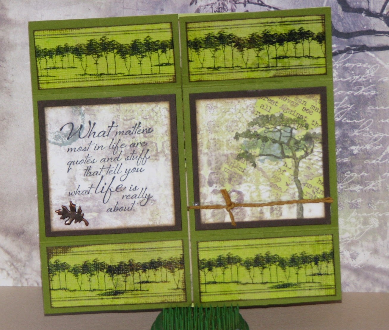
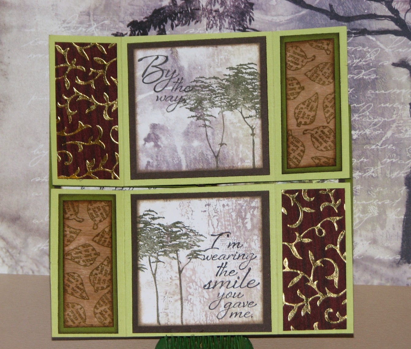
My project this month is a Never Ending Card.  It's one card that  is filled with 4 different cards all in one! I shared the Never Ending Card Instructions on Monday and now I can share the finished product...

If you've never seen a Never Ending Card it's all in the way you fold and glue the pieces together.  With a flip of the card you will reveal 4 totally different lay-outs - 24 individual sections that can be decorated in any number of ways.  Here is my "Trees" interpretation....

Card Front:


Lay-out #2: 


Lay-out #3: 


And the card back...


I also had the wonderful opportunity to be the Guest Artist for the Trees Greetings to Go Kit this month.  Here are a few of my favorites:


Click here to see all 15 of the Trees Greeting's to Go cards I made.

and finally, I didn't forget about my Gnome friend...
This month he is paired with the Trees kit stencil, stamps and papers.
I colored him (and the card) using a variety of  Distress Stains.


Hope you've enjoyed my offerings this month....
Your next stop on the Trees journey is

if at any time you loose your way the complete list of hoppers can be found on the

Tuesday, March 25, 2014

Altered Pages Trending Tuesday - Stencils in Collage

Yes this month's Altered Pages Trending Tuesday centers around stencils used in collage projects.  I had so much fun with this challenge because a) I love stencils and as you all know - b) I love Love LOVE Collage!!!

Here is the stenciled canvas I made....  
Spring Collage 


Supply List:
Altered Pages Collage Sheets: Vintage Eggs; French Millinery for Easter;  Redoute III; Les Chapeaux


and the process...

I added bits and pieces of various vintage ephemera.


I then started playing with some Spring-y colors of Gelatos & a Flower Stencil


Next, a few pieces of washi tape here and there... 


I used guilders paste paired with a harlequin design stencil...


Gesso on these small dots


and some more Gelatos to make these dots.


I then glued on several different collage images I had fussy cut....


A bit of pen work (both black and white); oil pastel details and the word spring which I stamped with a set of vintage alphabet stamps I have and I call it done!


So there you go...my interpretation of stencils used in collage!
Be sure to check out the rest of the projects one the Altered Pages Artsociates Blog.
Happy Spring Everyone!!