Pages

Friday, July 26, 2019

Playing - Masterboards!


Recently I decided I just wanted to play with inks and embossing powders and well, let's just say I wanted to get inky. I decided that making a masterboard would fulfill my needs.


I started out from a page from an old atlas...the pages with all the city listings. I love these pages - so much potential!  I started inking...scraping the ink across the page with a squeegee this way and that. Dragging lots and dragging a little.


Next a bit of stenciling


Some stamping, some embossing even a bit of pen work and doodling.


And I ended up with a whole sheet of inky goodness to create with.
I made 5 cards, 2 ATC's and I even had left overs that I'm going to use as book marker/tags.

If you'd like to see the full tutorial, please check out -


Stamp - Craft Consortium - Wildflower Meadow - Fresh Cut

Stamps: Sunny Studio - Lemons; Rubber Stamp Tapestry - Sentiments

Stamp - Unity - flower; Stamplorations - Leaf Stencil; Circle Grid - vintage unknown

Stamps - Rubber Stamp Tapestry

Stamps - Sunny Studios

Collage Images & Sentiments - Finnabair

Have a lovely day friends!


Thursday, July 25, 2019

Alcohol Ink Comparison - Marabu, Ranger, Brea Reese

Hello Friends -

I've been reading lots of comments on FB about the various Alcohol Inks that have hit the market recently. I thought I'd do a little side by side to show you what they look like on various materials.

The first thing I want to mention is that each bottle is different as far as the dispensing tip so this is going to make a huge difference on the control and how much ink actually comes out in a single drop.

The tip sizes from smallest to largest -

Marabu tips come sealed and they tell you in the instructions so pierce the tip with a push pin. That gives you some idea about how small it it.

Ranger's tip is about 3-4 times larger than a pin prick for the AI and much larger for the Metallic Mixatives.

Pinata's bottle for the AI is the same size as the Metallic Mixatives dispenser and is difficult to get just one drop.  This ink also has a tendency to shoot out when you're tipping the bottle.

 Brea Reese's tip is huge and VERY hard to control. Most of the time you get 2, 3 or more drops  unless you are extremely careful.

Here are the colors I used:

Marabu

Ranger

Pinata (didn't have their black)

Brea Reese


Glossy Cardstock 

Marabu - all single drops
Ranger - Blue 2 drops, rest single drops
Brea Reese - Blue 2 drops, Red 3 drops, Black 1 drop
Pinata - Blue 2 drops, Red 1 drop


Craft Plastic from Grafix

Marabu - All 1 drop
Ranger - Blue 3 drops, Red 2 drops (plus a drop that shot up by the Marabu Red), Black 1 drop
Brea Reese - Blue 2 drops, Red 3 drops, black 2 drops
Pinata - All 1 drop


Yupo

Marabu - Single Drops
Ranger - Single Drops 
(plus 2 extra tiny drops that shot out as I was tipping the bottle)
Brea Reese - Blue - 2 drops, Black & Red Singles
Pinata - Singles

As you will notice the "spread" for the Marabu was consistent on all 3 materials - similar in size, shape and color. The black is more of a charcoal rather than pure black. 

Ranger's spread was all over the place from one material to the next. On one material it kept it's shape, on the other 2 is varied widely and feathered more than spread.

Brea Reese - I can't explain it but the spread varied the most of any...I have no idea why but it was just so random.

Pinata - Spread the least of any of the inks...they are fairly thick. Not sure if my inks are old stock or ???  It didn't fair very well in this test.


Metallics

I wanted to compare Marabu's Metallic Alcohol Inks to Rangers Metallic Mixatives. I did this to show you why it's not a fair comparison (because so many people are comparing them).  You should also keep in mind dispenser tips....Marabu - Pin Prick; Ranger - Large Hole.


Marabu's Metallic Alcohol Inks are just that...alcohol ink. They are thinner therefore they don't have as much metallic colorant to them.  


Ranger's Metallic Mixatives have far less alcohol and larger and more metallic particles.


Metallics on Glossy Cardstock - You can see right off that Marabu's Silver looks more pearl. They spread like a typical alcohol ink would.  Ranger's Metallic Mixatives are a bit different - not nearly as much movement.


Craft Plastic - Again Marabu is typical AI movement - Ranger's thicker Metallic Mixatives not as much movement but further spread on this as opposed to the glossy cardstock.


Finally the Yupo - basically the same as Craft Plastic Results which makes sense since they are similar substrates.

You can make your own observations by the pictures.
Hope this is helpful for all you inky folks out there.


Monday, July 22, 2019

Mosaic Tile House Number Plaque

Happy Monday Friends!

Our local library has a craft therapy session each month (sometimes more than one) and last month they offered a class to make these fun mosaic house number plaques!

I've done mosaic pieces before but I needed a new house number plaque and I thought this would be the perfect time to make one. Of course I made one in blue - in this photo it is in half sun, half shade which is why the last one looks white and the 6 & other 1 look like they are light blue.   I used black grout for this plaque.


I also made a second one using my second favorite color green! The numbers are all beige - (took this photo inside so it all looked the same) and white grout. I thought the white looked better with the green.


We started off by penciling in the letters/numbers we wanted on the plaque; everyone then decide on colors and gathered up shards left-over from a stain glass class they hosted earlier in the year. If you do this get more glass than you think it should take. I was surprised at how much it actually took - far more than I would have thought.  Then you begin assembling it like a jigsaw puzzle. Quite a few of the pieces I chose fit my plaques as is but I also had to break several into smaller pieces to "fill it in". I can't remember what type of glue we used but it was similar to E6000.  

Everyone used different techniques to make their plaque - some people just picked up a piece of glass and glued it on, others took lots of time to fit everything together perfectly... I decided to do something in between. I added large focal pieces that fit the design first and then I went back and took more time breaking and filling it in. It's totally up to you but it did take much longer than anticipated. The original class was 2 - 2 hour sessions. It ended up taking much longer.  We were no where near finished after the first session so we were allowed to take all of our materials home to finish gluing the glass down. 

The second session we grouted them, let it dry a bit and started cleaning them up. I was able to grout and clean both plaques during the 2nd session and did a bit of cleaning up at home once they had dried completely.

This was such a fun project but I must warn you the glass is sharp. Of course I didn't cut myself until I was wiping off the grout along the edge of one of the glass pieces right before we grouted them.. Slit my finger right open. Aside from that it was really easy.  

I have no idea how I'm going to display mine...it turned out being soooo heavy and we just had our siding replaced last year. Eric would crap if I drilled holes in it. LOL!!  Any ideas?

Hope you all have a great week!

Wednesday, July 17, 2019

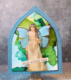
Midsummer Dream Gothic Arch

Good Morning my Inky friends!

I have been playing with more Gecko Galz collage images but this time I paired it with an alcohol ink background. I started off by sprinkling a variety of Brea Reese Alcohol Inks on a piece of Craft Plastic by Grafix.  It's a really cool plastic paper that is (IMO) more sturdy than Yupo and far less expensive. 


After I was satisfied with the look I hand cut a gothic arch shape from the inked plastic/paper.  I edged it with the StazOn Pigment ink and mounted it onto a larger gothic arch that I had covered with Sapphire/Sapphire Starstruck Rinea Foiled Paper.


I fussy cut the lady from her background (from one of the Ophilia collage sheets) and gave her a set of  lovely blue butterfly wings (Butterfly Wings).  I really wanted to highlight the fairy and AI background so I kept the embellishments to a minimum and added the sentiment and a bit of gold thread.  


She looks so serious but lovely at the same time...
I think she's trying to solve the world's problems.


Have a lovely day my friends!

Sunday, July 14, 2019

Gecko Galz - Midsummer Dream

Hello Friends -

I hope you've had a lovely weekend up till now.  I have been playing a bit with stamps and inks and collage images. I created this card for a friend using one of Gecko Galz images from the Spirit of the Fey collage sheet for the Midsummer Dream challenge this month.


I just loved the pink and green so I went with it.  I used a new set of Rubber Stamp Tapestry stamps - Crows in the Cornflowers which I stamped using a few Kaleidacolor ink pads (Fresh Greens, Blue Breeze and Berry Blaze) and VersaFine Clair Paradise and Verdant.  


I added a bit of washi tape and some little gemstones for a touch of sparkle.  It is mounted on a piece of Ebony/Ebony Starstruck Rinea Foiled Paper.


Supplies:

Gecko Galz - Spirit of the Fey
Imagine - Kaleidacolor - Berry Blaze, Fresh Greens, Blue Breeze; VersaFine Clair - Verdant, Paradise
Rinea - Ebony/Ebony Starstruck Foiled Paper
Rubber Stamp Tapestry - Crows in the Cornflower
Cardstock, Gemstones, Washi Tape

Thursday, July 11, 2019

Strawberry Delight!

Hello Friends -

I wanted to share some fun treat boxes I made using Rinea Foiled Paper....

I made these fun strawberries from die-cut circles!! 
They were so quick and easy you just won't believe it. 


 For the complete tutorial please see:


Wednesday, July 10, 2019

Light Your Way...Fairy Lantern

Good Morning Friends!


I hope you're all having a wonderful week.
Today I want to share a fun project I made recently that will have you saving your glass jars!


This is what it looks like in daylight...I wish you could see the shimmer - it is covered in a layer of Sparkle Mboss Embossing Powder. This embossing powder has a beautiful iridescent glitter sparkle which is just lovely.


And when it gets dark it's just as lovely when you switch on the little LED Tea Light!!

You can see full supply list and detailed instructions here:


Have a magical day friends!

Sunday, July 7, 2019

Fridafest Day 2

Hello Friends!


Image may contain: 4 people, text

For today's creation I was going for a "vibe"

LCD Stamp - Frida 1

I wanted to go with a raw in your face look much like her art so I gave her a very bright and vibrant aura using Marabu Art Crayons. I loosely colored around the image with yellow, orange and red then smudged it just a bit and left it to dry. I thought this technique fit very well with the quote from the stamp.  Once the art crayons had a chance to dry a bit the panel was then mounted on a white card base.  

Be sure to check out the Lost Coast Design Blog for the rest of the hop links 
and details on how to enter to win!

Hop around and leave some love here and on all the team's blogs for a chance to win
$10 to spend at Lost Coast Designs and/or Carmen's Veranda
We will be back again tomorrow with some more inspiration.
The more comments you leave the better chance you have to win a prize!

For another chance to win you can share up your Frida Kahlo inspired projects.
If you need some inspiration check out the wiki link above, or the teams makes of course!!
Your project can include a Frida Kahlo image, or be inspired by anything associated with her, but please explain your inspiration if it isn't obvious and don't forget that we need to see the use of real rubber or clear stamps.  Please don't forget to tell us the maker of your stamps and those using
Lost Coast Designs and/or Carmen's Veranda stamps
will get an extra chance at the random draw.

Saturday, July 6, 2019

Fridafest Day 1

Image may contain: 4 people, text

Hello Friends and welcome to
Day 1 of the Fridafest Blog Hop!

Have you seen the amazing Frida Kahlo Stamps in the Lost Coast Designs Shop?? Linda has now added 4 new designs so we decided to showcase these beauties with two days of blog hopping.


Here is my creation for today. I wanted to go a bit outside my comfort zone so I decided that red was going to be a main color focus for this project. I also wanted to give her a bit of bling so I painted the image and card with mica watercolor paints. She was initially stamped using VersaFine Clair Nocturne ink, I then colored her using USArtQuest Mica Color watercolor paints. After I had painted the image I tore around it and inked it with Tulip Red VFC ink.

To create the background I mixed up a watery Super Russet (red) Mica Color paint and flicked it over  the entire black card panel. It is so shimmery in the light (see the photo below...).


"Inspiration" was stamped on a scrap bit of a gelli print I had in my stash.
I finished the card off with a few tiny Prima flowers and mini leaves I hand cut from Emerald Rinea Foiled Paper.

Be sure to see the Lost Coast Designs Blog for a full list of hop stops here:


We will be back again tomorrow with some more inspiration.
The more comments you leave the better chance you have to win a prize!

For another chance to win you can link up your Frida Kahlo inspired projects on the Fridafest blog post.

Your project can include a Frida Kahlo image, or be inspired by anything associated with her, but please explain your inspiration if it isn't obvious and don't forget that we need to see the use of real rubber or clear stamps.  Please don't forget to tell us the maker of your stamps and those using Lost Coast Designs and/or Carmen's Veranda stamps will get an extra chance at the random draw. 

Thursday, July 4, 2019

HAPPY 4TH OF JULY!!!

Happy 4th 
to all of my American friends out there celebrating our wonderful country!!

Deep Red Stamps - Star Spangled Banner

Imagine - VersaFine Clair - Tulip Red, Blue Belle, Nocturne, Acorn, Pinecone; On Point Glue
Colored Pencils, Foam Tape, Glitter


Monday, July 1, 2019

Celebrate It! Challenge - Lost Coast Designs


Image may contain: 1 person, text


Hello Friends - Happy July!


Can you believe that we are starting the 7th month of the year...I just don't know where the time has gone.  Anyway, the first is always the start of a new challenge at Lost Coast Designs and this 2 week challenge is - Celebrate It!  Stamp a card that celebrates anything and you're all set to enter!


Here is what I created for today....


I used the high kickin' Showgirls stamp which was stamped using VersaFine Clair - Nocturne ink. I colored it using Arteza colored pencils and added a bit of glitter and pen work on their shoes.  It was then fussy cut and set aside.  

The background is a piece of a gelli print using red, white and blue (thought it was appropriate for this holiday season). This print was trimmed and mounted on a piece of Sapphire Starstruck Foiled Paper by Rinea. At this time I flicked on Mister Huey's Opaque White Color Mist. I then stamped the sentiment along the right hand side using Tulip Red VersaFine Clair ink.  

This panel was mounted on a white card base and then the showgirl image was affixed to the card using double stick foam tape.

Image may contain: 1 person, text

Supplies:

Lost Coast Designs - Showgirls; Party Words
Imagine - VersaFine Clair Ink, On Point Glue
Arteza - Colored Pencils
Mister Huey's - Opaque White Color Mist
Glitter
Cardstock
Foam Tape