Pages

Thursday, March 31, 2016

Vintage Mixed Media Collage

My pc had a fit over the weekend so I've been using my lap-top for everything since Saturday.  It's my back-up computer that I used mainly for photo manipulation and taking it with on vacations.  It doesn't have office on it which I really need for lots of stuff.  You know that feeling when things just aren't right.  Well it's put me in a funk so I've not been feeling real creative.  

So today I thought I'd try something different.  I decided to try and create a vintage collage and limit it to a single color palette....


This is what I created so far....I had a few false starts but after I left it set for a bit I finally got to a point where I'm liking it.  It might be the colors that threw me at first.  I wanted to go browns leaning towards a vintage rose color in the flowers.

So here's what I did....


First I pounced VersaMark through some lace...


Then sprinkled on clear ep and heat set to melt.


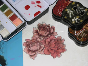
Next I stamped on a few flowers


and set about painting with some Prima watercolors and stamped on the rest of the flower with StazOn inks.


Next to add the browns - I scribbled on Prima Water Soluble Oil Pastels.  I used a waterbrush to  blend and spread them over the canvas.  I used some of the pretty peach color (see the previous photo) in the large open area to blend it all together.


I pulled up some of the color in areas with a baby wipe through a stencil.


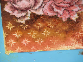
Here is one of my screw ups - sort of.  I thought it needed some gold so I applied some Creative Medium over my distress harlequin stencil.  As you can see when I hastily removed the stencil some of the CM came up with it...  @(*%&@(*&%#  That's when I left to take a break.


So I came back after supper and peeled the CM off completely - I really like how it looks now!  I stamped some text across the canvas and then stamped the bunch of roses.  Once the roses had dried I added a bit of watercolor to the flowers.


I stamped one down in the corner too.  I added some black modeling paste over a really pretty flourish stencil from Deco Art (one of my fav. stencils!)


I then took a black colored pencil and sketched a bit around each of the roses to make them pop a bit. 


And that's where I'm at with it at the moment.  I'm not sure what to put in the open area.  I thought about using a stamp to add an important word but all of my word stamps (dream, inspire, etc.) are all too small.  For a fleeting second I thought about attempting to write something but hand writing on an almost finished canvas scares the heck out of me.  Any suggestions?  

I did get word this evening that my computer is done!!!  YEAH :)  They had to replace something and re-install windows.  I may have lost some info but I don't care - it's done and I will be back in business tomorrow!!!  Can't  wait - it's like an old friend that has been missing

Supplies:

Blick Art - Canvas
Imagine Crafts - StazOn, VersaMark, Clear Embossing Powder, VersaFine
Deco Art - Stencil, Black Modeling Paste
Prima - Watercolor Paints, Water Soluble Oil Pastels
TCW - Stencils
JFF Stamps - Text Stamp
Deep Red Stamps - Rose Bunch
Altenew - Peony Stamps
PrismaColor - Colored Pencil

Wednesday, March 30, 2016

Paris Flea Market Blog Hop

Welcome friends to the Club Scrap Blog Hop for March.
This month we are celebrating the kit - Paris Flea Market!

I absolutely love this kit,,,I think it is my most favorite kit ever.  I had a hard time trying to decide what to make so I ended up making 2 different projects, one using mostly the stamps and the second project using mostly the papers. Funny thing is both are in the form of a box....


My first project is a Paris card in a box.  This fun little creation uses lots of the stamps from the kit plus a few images cut from some of the papers.  I used black script print on the outside of the box and pink on pink harlequin for the inside of the box.  I ended up making 4 inserts inside the box to hold all of the goodies I wanted to layer in.


Of course with so many layers, when folded up it doesn't exactly lay flat in the envelope but it does still fit into an A2 sized card envelope.


My next project also starts out as a box...


But when you remove the lid...you find a fun explosion album with the Eiffel tower stuck right in the center!  The tower is actually a flat die cut that I made into a 3d piece by cutting 4x.  I glued one edge of 2 die cuts together then glued the other 2 together in the same way.  Once the glue had dried, I opened up each set and glued them together making it into a dimensional piece.


This box has 3 layers - the white script print in the center...


The pink print for the largest box...


And this lovely floral print that reminds me of vintage wall paper.  It makes up the mid-size center box set of album pages.

Hope you've enjoyed my projects...

it's time to head on over to 


to see what she has created!

Don't forget if you get lost along the way the complete list can be found here: 

Tuesday, March 29, 2016

irRESISTible Pico Embellishers

WOW, talk about causing a stir!  Many people have asked about the Pico Embellishers that I talked about yesterday on the Zet Dot Rock post.  I guess I didn't realize that they were still a hidden gem so I thought I'd introduce you to them and tell you a bit about them.


irRESISTible Pico Embellishers are these nifty bottles of goodness.  The medium is the same as the irRESISTible Texture Spray in a convenient bottle with a needle nose tip applicator.  This applicator allows you the freedom to write, draw, color or simply create fun dot embellishments with the same dimensional resist medium.


The fine tip allows you to create tiny dots the size of a pencil dot to virtually any size you want/need.


I tried to show the dimensional nature of this medium.  Hopefully you can see how tall the final dot is compared to the rest.  Once dry the medium retains this height unlike so many other dimensional mediums out there.


Here I wanted to show how easy it is to write with the Embellisher.


This fun medium comes in all sorts of colors....7 colors to match the Radiant Neon Pigment Inks,


Bronze, Copper and Gold Metallics...


Black, White, Shimmer and Clear


As well as 23 additional colors that match the Memento line of inks.  Each bottle is 1 fluid ounce of medium which goes a long way!  One of the things I love about this medium is right in the name...it resists other mediums.  I like to use this medium in conjunction with watercolors or Color Burst / Brusho color pigments. It's such a fun and easy way to make certain areas pop with an alternative color or  to "white out" some areas in my project by using white, clear or shimmer Pico and add dimension at the same time.   

The dimensional nature also lends it's self well to mixed media projects. I especially love the black and metallics for mixed media type projects because the gloss aspect adds another dimension to what can be a rather matte looking finish.  I have actually painted acrylic paints over the top of Pico before and polished it off to create an amazing contrast between the two.  

Black or White Pico embellishments used on the same color of cardstock is beautiful because the contrast of the white on white (or black on black) creates a classy, rich look not easily achieved with just paper and a single medium.

So there you go, another must have medium for your crafty tool box.


Monday, March 28, 2016

Cabin Fever Anyone? Zen Dot Rocks to the Rescue!

What are Zen Dot Rocks???

Check it out....


These are SOOOOOOO much fun to make, once I finished the front of the rocks, 


I flipped them over and played on the back too!

I made these Dot Rocks by using various colors of IMAGINE Crafts Pico Embellishers.  They have a very fine needle nose tip applicator that allows you to make teeny tiny dots to virtually any size you want.  I worked on 2 rocks at the same time.  The Pico Embellisher medium dries very quickly so while one rock was drying I dotted up the second and kept alternating between the two...until I ran out of room.

These rocks really are very zen when you're working on them.  You just start dotting away and the time just flies.  The best part is that you don't need any special tools, just a rock, Pico Embellishers and time.  

We don't have many flat smooth rocks like this around here so Santa brought me these two from southern Indiana...Yes, I got rocks in my stocking last year for Christmas and was thrilled! Everyone else looked at me like I was crazy.  I need to find more because these are too much fun to make.  I have so many ideas but alas no more rocks.  I even tried to order some from some place out west...never did hear back from them - they probably thought I was nuts too ;)  LOL!!  Oh well, that's going to be my mission this summer...smooth flat rocks!


Sunday, March 27, 2016

Happy Easter!

These are a few vintage Easter postcards from my collection.   
Most are from the 1890's - the last 2 are from 1908.

Enjoy!


Friday, March 25, 2016

Distress Crayon's - Part 2 & GiveAway!

NOTE - I have added additional information at the bottom to answer a few questions I have been getting...

O.k. so I decided to see what the Distress Crayons looked like side by side with Gelatos and Prima's Oil Pastels.


First, let's take a look at what you get with each of the mediums...  As you can see even though the Distress Crayon is about twice the size of a Gelato stick the contents are about the same with the Distress Crayon being a about 1/4" longer.  These two products probably have the same amount of medium because the Gelato stick is actually a bit thicker in diameter than the DC.  The Prima crayon has probably 2-3 times more medium as it's not only longer but has a much thicker diameter as well.

Price wise -

Prima's Water Soluable Oil Pastels - $15.00-20.00 for 24 crayons = $0.63 - 0.83 each

Gelato Sticks (regular size) - sets vary greatly depending on set size and extras. Generally you can get a set of 4 for 7.00 = $1.75 each

Distress Crayons - $11.00-15.00 for set of 6 =  $1.83 - 2.50 each


So, I did a side by side of Gelato, Distress Crayons and Primas Water Soluble Oil Pastels on plain regular cardstock.  I chose this substrate because let's be honest, most people aren't going to take the time to gesso a piece of cardstock for every card they want to make.

So, I scribbled a 3" long line with each of the mediums - I smudged the bottom portion with my finger tip.  As you can see the Primas smudged away to the point you couldn't see the initial markings, smudged Gelatos didn't do quite as well but - you can tell it's a bit darker where the initial scribbles were but it did disperse very well.  Distress Crayons on the other hand were more difficult to diffuse - they just don't glide over the paper much and all of the lines still show up.

Next I went in with a water brush and tried to move the mediums around that way. Gelato's and Primas were very water friendly and could easily be spread over a very large area.  Great for watercoloring if you chose to do so as they dissolved quite easily.  Distress Crayons on the other hand were difficult to dissolve and didn't have much travel, you could in fact still see all of the initial markings which no matter how much I tried I couldn't diffuse on this or any other attempts.

Since that wasn't working so well I decided to try a "removal" technique - basically just color a piece of cardstock with the various mediums, over lay a stencil and use a baby wipe to remove the color medium.


First up I tried the Distress Crayons - as you can see I had a difficult time smudging out the crayon.  The original scribble lines don't go away and I really couldn't blend the colors much either.  


I placed the stencil over the panel and tried to remove the medium with a baby wipe.  I had a difficult time with this.  I just couldn't pick up the color much at all - in the end I basically rubbed the top layer of paper away trying to get the color up.  (see below).


I ended up pilling the paper instead of removing the color...not the look I was going for.


Next up Gelatos - scribbled, blended and removed without much problem.


Finally Prima's - WOW, I used the same amount of medium as the other two examples but had far more medium than was necessary.  It blended so nicely and I could have moved it over a much larger area than I had room on my panel which is why some areas are still so dark with pigment.  A little bit of this stuff goes a very long way!  So then I placed the stencil on the panel and easily removed the color with a baby wipe.  This took almost no effort whatsoever.  The results were amazing.
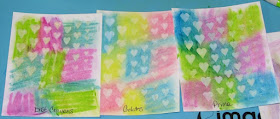

Here are all three side by side.  You can see the startling difference for yourself.  I had planned on trying a few more technique comparisons but decided that I had seen enough.  I don't know about you but I don't want to have to fight a medium to get it to work.

***Edited to add - a couple people have mentioned that in some of the Distress Crayon videos they make the colors/techniques look amazing...Why don't they look like that here?

Here are a few things to think about/look for - if you look at many of the demos people share if you really look when they run a waterbrush over them - they get the same look but they don't focus on it for long.  They just swish the water over the medium then move on.  In most of the videos I've seen of the Distress Crayons when you color directly on an uncoated (no gesso or collage medium) paper/cardstock/etc. some of the color moves around (as it does in the above examples and again below) but you'll be left with a darker stain where the medium was originally applied.


So I colored an area that has solid color and a heavy coat as advised - 


I then went over it to blend it out with a waterbrush.  While there is color movement you still end up with the darker stain of color where the original DC was originally applied with a much lighter wash surrounding it.


It is stated right in the demos that you have to use LOTS of product to get the intended look - I find that this is far more product than what you would normally apply with Gelatos or especially the Prima pastels (a little goes a very long way).  In this example I colored a large block of color with a thick layer of medium and smeared it around with my finger.    The black lines outline where the original product was applied.


Next I overlapped two colors to blend - both solid coats with heavy layers of medium.


Smudged it together with my finger tip and this is the result.  The black lines show where the colors were originally colored and where they overlapped.

To get the really vibrant mixed colors the Distress Crayons were applied on a coated surface (coated with something like gesso, a collage medium, or other sealed surface) then mixed but if you notice most of the time the demonstrator either adds additional layers of Distress Crayon or another Distress product to enhance the results.  Many of the examples you see are not just a single layer of color as shown here.

I'm not saying these crayons are good or bad, that is for you to decide. I'm just showing what this particular medium looks like in a few real life tests/comparisons.  I don't get paid for this and I buy the product with my own money.  Again, I'm not the judge here, just showing you what it looks like IRL.

So there you go...
the choice is yours to make.

Give-Away Time

Would you like to try the Distress Crayons for yourselves?  If so, please post below. (be sure I have some way to contact you)

I have 6 sets (2 of each set) to give away - please note that 3 of the sets were used to make the examples so while they aren't brand new there is still lots of life in them to experiment and play with. You have until April 2nd to post a comment to be eligible for a set.  If there are more than 6 people that would like to try them I will draw names at random using Random.org.