Pages

Thursday, June 30, 2016

Artist, Designer or Both?

Recently I saw a link to an article on Facebook with the title Designers are not Artists.  In the opinion of the author he stated that designers weren’t artists and visa versa – basically the whole jist of the article was that designers created to promote a product and artists created to express emotion. 

Someone else sent me link to a similar article that stated good art inspires, good design motivates (people to buy products, participate or join).  It went on to state that artists start with a blank slate and work from a viewpoint, opinion or feelings while designers have a fixed starting point such as a message, idea, image or action.  It also went on to state additional differences – good art is interpreted, good design is understood; good art is talent, good design is skill; good art sends a different message to everyone while good design sends the same meaning to everyone.

Why am I talking with you about these articles?  Someone asked me about why I’m “wasting time” being on design teams (and sent me the link to the 2nd article).  This isn’t the first time I’ve been asked about it over the years and I’m sure it won’t be the last.   It got me thinking about why I am on design teams and that maybe I should explain my reasoning’s.

Let me first start by saying these articles (IMO) are crap and that I consider myself a good artist, teacher and designer!  In my experience greedy, mediocre or lazy designers intensions are only to get free products and to entice people to buy/participate/join (and there are many of them out there).  Great designers can take anything presented to them (be it an idea, product or image) and create art which speaks to people in different ways AS WELL AS inspire and motivate.   This is what I strive to do on all of the design teams I participate on and with my own personal art.

Sure I’ve seen lots of designers who are only out there to sell a product (or get free products or are motivated by the all mighty $$$’s) who in turn do a minimum amount of work and just pile on the crap with their only intentions being to put product on the screen in front of as many people as they can making them want more, more, more. 

On the other hand there are other designers out there who put lots of time and effort into each piece of art they create which not only showcases a particular product but inspires, instructs and encourages others to create as well.

Lumping these two very different groups of designers together is like mixing oil and water or saying that the Eiffel Tower is just a pile of metal.

I “waste” my time on design teams because as an artist I have found that IMO the products these companies offer are quality items and that with knowledge and instruction can benefit other artists.  I try to provide that knowledge by spending my time experimenting and through trial and error come up with new, different or fun innovative ways to create art which I in turn share with you.   It might be something as simple as instructing on how to use a new product with an old or forgotten technique; using a product in a totally different way that originally intended or simply make a piece of art to share its beauty.   When the artist in me is truly inspired to create the teacher in me comes out and wants to share it with others.  I want to encourage, instruct and make you want to create as well.

Design teams also offer me a challenge and give me the opportunity to use products I might not normally have thought of purchasing or wouldn’t have been able to purchase.  Ink Stains isn’t a money making proposition… I purchase products for both use and giveaways from my own pocket.  I purposely don’t sell ads or monetize the blog so that I’m not beholding to people/companies that I wouldn’t normally stand behind.

I couldn’t (and wouldn’t) represent a company that I didn’t have 100% confidence in; I’m not in it for free stuff and it’s not paying my bills. I won’t lie or deceive to try to get you to purchase a product, I won’t have you believe that brand “X” is the be all and end all.  I do it because I am inspired and want to share that inspiration with you. 


I design with my artist soul and yes, I’m proud to say I am an Artist AND a Designer!

Wednesday, June 29, 2016

Boardwalk Club Scrap Blog Hop + GiveAway!

What's today????  
YES - Hummmmp Day and it's also time for the

This is such a fun summery kit - lots of the ole' red white and blue plus a bit of a summer / beachy / boardwalk feel to go with.  With all of the fun summer memories in the makin' I thought it would be nice to create an album with ample acreage to keep them in one place.

And here it is.....


When opened up this album has 8 double sided 4" x 4" flaps on each side -


Plus an extra space on each side under all the flaps.  All of this translates into 34 areas for photos and/or journaling.


Would you like to preserve your summer memeories in this album?
Simply post a comment telling us about your favorite summer past time, event or memory is.

You have until July 9th to post your comment to be entered to win!

Your next stop on the hop is:


and remember
if you get lost along the way, 
the complete hop list can be found here:


Happy Summer Friends!

Supplies:
ClubScrap.com - Boardwalk prints, cardstock, rubber stamps, button, cut-aparts, chipboard, book binding glue.
Imagine Crafts - Memento Dye Inks, Memento Dual Tip Markers
Other - Stretch Cord

Tuesday, June 28, 2016

Coloring & Drawing with Grandma

A couple weeks ago my grandma (93) fell and broke her hip...she's been in the hospital then nursing home ever since.  She has had to give up lots of her favorite crafts over the years ~ painting, crochet, knitting due to poor eyesight and arthritis.  She mentioned that she was so bored at the nursing home because she really can't do much of anything. They have a tv but seriously, how much tv can one person watch...specially with the crappy programing on lately.

She has always been into art - she's the one that originally got me interested in it so I thought it would be fun to take her a few goodies that hopefully she would get some enjoyment out of.  The first is a notebook/journal that I made....


I used some of the Club Scrap Boardwalk kit because it was bright and cheery.  
I stamped her name on the front just in case it was shuffled around.


Inside is blank drawing papers....
I thought she could draw, write down notes or whatever inside.


This is the inside of the back cover - using up scraps.


I told her the other day that I was going to color with her when I came back - I explained about adult coloring books but I think she thought I was kidding.  So, I am also going to take her this coloring book I bought by ColorIt.com.   I originally saw it advertised on FB so I went ahead and bought one to try.  I got the wild animals edition which was $16.00.


I have to say I was very pleased with it.  The pages are 8.5x11 (plus the binding) and printed single sided on heavy cardstock.  The front and back covers are both heavy chipboard - almost book board weight and it is spiral bound.  This is very nice because once open the front and back covers make a great sturdy foundation to color on even if you're not at a table.


The above photos are a  just a couple examples of what the pages look like.  They are nice big images that have heavy black outlines great for young and old alike.  This is such a nice coloring book I think I may have to buy another for myself.


I am also taking a small cigar box that I made dividers in for colored pencils, drawing pencils and pencil sharpener and eraser.  At first I just tossed them in the box but I couldn't stand it so I made the little divider out of cardstock.

What do you think?  I'm going to take it to her today or Wednesday (whichever works out)....I sure hope she likes it and that it helps pass the time.  She's always been very active so this is hard on her.

Monday, June 27, 2016

Corset Bachelorette Card

I wanted to share a card I made for my future DIL.  She had her bachelorette party this past weekend and sadly I missed it (bad food at a local restaurant).  I wanted to share the card I made for her though....


She likes hot pink, glitz and animal prints so I thought this was a good combo.  
It's got lots of fun elements - the lace, ribbon, brad "buttons" and glitter.  


What do you think?
Girly girl enough?

I'm giving it to her next time I see her but I wanted to share -
I really liked how it turned out.

Supplies:

ClubScrap - Cardstock, Stencil
Imagine Crafts - Memento Inks, Spong Daubers
Other - lace, ribbon, brads, glitter glue
Corset Card Template - my design

Saturday, June 25, 2016

Imagine Crafts & CAS-ual Fridays Blog Hop

Welcome, welcome my inky friends!  Today I have a special treat to share with you.  The Artist Team at Imagine Crafts is taking part in a joint blog hop with the team from CAS-ual Fridays Stamps!  I was having so much fun with the stamps I rec'd from CAS-ual Fridays that I made not one but three cards to share with you today!


My first card was made by stamping the zig-zag's using the Kaleidacolor ink pad - Specturm.  I then stamped the flowers using Radiant Neon Electric Yellow Ink with a dab of Radiant Neon irRESISTible Pico Embellisher - also in Electric Yellow in the center of each flower.  The sentiment - thanks - was stamped with Tuxedo Black Memento Ink.  The panel was then mounted on a yellow card blank.


This card is the polar opposite of the bright colors of the first card.  I wanted to stick to a softer more muted palette so I used Dandelion, Sky Blue and Pear Tart Memento Dye inks to stamp the design elements.  The sentiment was again stamped with Tuxedo Black Memento Ink and Wedding Dress (white) irRESISTible Pico Embellisher was used to add a bit of embellishment.  This panel was mounted on a soft blue card base.


Finally my third card is a bit different.  I stamped this card in layers.  The base panel was stamped using the Kaleidacolor ink pad - Baby Powder - bright pastels that I toned down by adding a framed piece of vellum on top.  I then stamped the sentiment and flower on the vellum piece with Jet Black Staz On ink.  The flower was colored using Dandelion Memento Dual Tip Marker.  I finished off the card by mounting it on a yellow card base and added a few dots again using the Wedding Dress (white) irRESISTible Pico Embellisher.

I had so much fun with these stamps, 
I'm sure you'll be seeing more of them in the future!
Thanks so much for stopping by!

Be sure to comment on the blog posts as you go for a chance to win a $50 prize packages from both CAS-ual Fridays and Imagine! Winners announced on Monday the 27th!

Your next stop on the hop is


and 
if you get lost along the way
you can find the complete list of hoppers here:


or


Supply List:

Imagine Crafts:
Kaleidacolor - Spectrum, Baby Powder
irRESISTible Pico Embellisher - Wedding Dress, Electric Yellow
Memento Dye Ink - Dandelion, Sky Blue, Pear Tart, Tuxedo Black
Radiant Neon Pigment Ink - Electric Yellow
StazOn - Jet Black
Memento Dual Tip Markers - Dandelion

CAS-ual Fridays Stamps - Zigs & Zags; Wonderful Words

ClubScrap.com - Cardstock, Vellum
My Favorite Things - Stitched Frame Die

Friday, June 24, 2016

One for the guys....

Happy Friday Everyone!  I hope you've had a wonderful week!  I'm still trying to catch up from working on convention samples, vacation and work....  not doing so well but at least I'm making head way.

Today I thought I'd make a card for the guys using this months Club Scrap Kit - Boardwalk.  The challenge at the Male Room is to include buttons in your creation so I did just that!


Inside I stamped happy birthday.  We have lots of male birthday's coming up in our family so I'm sure I'll be using it soon.  I used 3 wooden buttons (included in the kit) along the left hand side.  I love how they have an etched design in the surface of the buttons.  It adds a bit of texture which is a nice change from normal buttons. 


Before I forget I pulled the name of the winner of the Creative License mini album.  The winner is....

I love this album! What a great gift for my son to put pics of his dream cars in! My car story is a sad one. I had a great 1973 Omega when I was in college. I decided to get it painted because it had been in a fender bender and a friend told me her boyfriend could make it look new. It took a while, but he did a GREAT job. I had the car back for about 24 hours when I was parked at my boyfriend's house. We were eating supper and heard this noise.... When I went out to go home, someone had hit my car and taken off :(

Congratulations Melanie!
Please e-mail me your snail mail address so I can drop your album in the mail.

Thursday, June 23, 2016

Hypno Origami Wall Art Instructions

Yesterday I shared my "Hypno" origami wall art piece with you...today I'm going to show you step by step instructions on how to recreate the origami pieces needed to make one of your own.


Instructions:

Tip - It's best to use text weight papers for origami because there are so many folds and creases.  I've made origami pieces using cardstock weight papers before and let me tell you after all of the creases and folds your fingers get very tired and sore.


1. Cut your paper into squares - the size depends on how large you want your finished piece to be.  I am using 4" pieces of paper for the example above.

2. Fold your paper into quarters and open up.


3. Fold one side towards the center and crease (leave closed).


4. Rotate your paper and fold the other side so it meets in the center, crease and leave closed.


Your paper is now divided into 2 halves at the center point by one of the original creases.  We will be working on each half separately from here on out.

4. Fold one corner of the smaller box toward the center fold line and crease. 


5. Open up that crease.


6. Rotate your paper, fold the second corner over toward the center fold line and crease.


7. Open up that fold and you have now made an invisible "X" on that side of your paper.  I put dash marks to help you visualize the folds we just made.


8. Rotate your paper and repeat the fold and crease to create the "X" on the second half of your paper.


Your paper should now have a creased "X" on each side of the fold line as shown above.


9. Tuck one corner under on opposite sides - one on each end as shown.


I have placed 2 small "X"s on the parts we will be working with next.

10. From the back side, push these sections towards the center.


11. Pinch these two pieces together.


12. Tuck them under the previously folded under triangle.


You should now have a folded pyramid on half of your paper as shown.


Here's the top view of the pyramid.


13. Rotate your paper to work on the other end of the piece.


14.  Push the two pieces towards the center; pinch and 


15. Tuck under the previously folded triangle.


You now have a boat!


16. Find the center fold that we made at the very beginning of it all - pinch the two pyramids together as shown above and below.


17. Let go of the pyramids and place them flat on your work surface....  You're done!  You now have one piece of your origami wall art puzzle.


18. Repeat this process 6 (for the smaller pieces) or 27 (for the larger piece) or as many times as needed depending on how big you want your wall art to be!  I know it sounds like quite a bit of work but really it IS worth it in the end.


Now as far as sizes go, I've made you a little comparison to show how big things get as you increase in size.  The smallest piece was made with a 4" square and measures 3.5" from tip to tip; the center piece was made using a 6" square and measures 5.25" from tip to tip.  The largest was what they used in the original piece I found - 8.5" square and measures 7.5" from tip to tip.  I can't imagine how big their finished piece was when they got done with it....must have taken up a whole wall!


Now I also wanted to show you why I liked using the Hypno paper for this project.  The paper itself has a very cool collage feel to it...lots of text, images and graphic design elements as well as multiple colors on each page.  This design paired with the pyramid form gives you something new to look at at every angle....  The photo above and the two consecutive pictures are different angles of the large piece. As you can see when you change your perspective the piece takes on a totally new look.


So much fun rolled up into one piece of art.


See why I told you it was worth it?
You won't be sorry in the end.

Wednesday, June 22, 2016

Hypno Wall Art

This month the Club Scrap Artist Team was asked to create something using papers from the Hypno Vintage paper collection.  A fun set of text weight papers with a vintage hypnosis theme.  Since it was text weight paper I decided that I wanted to include origami in the mix somehow so I started looking around and found this wicked cool idea....DIY Geometric Paper Wall Art by Jam Paper.


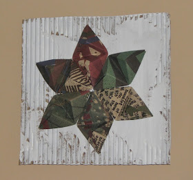
Their project calls for using 8.5" square sheets of paper which would make your art piece HUGE so I cut mine down to 4" squares.  I ended up making a matching 3 piece set - 2 smaller stars which use 6 folded origami pieces each and the larger focal piece which took 27 origami pieces.  


The large focal piece is mounted on a 13" piece of corrugated cardboard which was painted with Deco Art Americana Decor Chalky Finish paint.  The paper colors are kraft, green, muted red, blue and have all sorts of fun prints, text and designs on each piece of paper.


and each of the smaller stars are mounted on an 8" square of cardboard painted with the same paint.


I wish you could see and feel this piece of art... it is VERY dimensional and so much fun to look at from every angle.   

Tomorrow I will share how I went about making it (as the directions on the Jam Paper site are a bit vague).  Hope you stop by to check it out.  It's a bit time consuming but the finished project is so worth it.

Your next stop on the hop is 


and
if you get lost along the way 
you can find the complete hop list here:


Thanks for stoppin' by!