Pages

Monday, September 30, 2013

Multi Color Bokeh

Last Friday I shared my version of the Bokeh technique I saw over at SplitCoastStampers which used a combination of Gelatos & Dye Inks.
 
My Bokeh (bouquet) version used Shadow Inks instead of the Gelatos/Dye Inks. 
Well today I wanted to share a Multi-Colored Version!
(told you I thought this technique had great potential!)
I'm still using the shadow inks for color but you could use any inks you have on hand.  I just decided to pull the shadows out because I hadn't played with them in a LONG time.
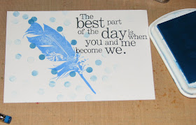
Anyway, I started out the same.  I stamped my sentiment and focal image on the card first.
I chose 3 colors to work with...Prussian Blue (really dark) a Warm Green (between green/blue) and Olive Green (lighter shade of green).   I choose a dark, medium & lighter color ink to help highlight each other...you'll see what I mean when you see the finished card.
So I started off with a layer of the dark blue dots ....


Then I added a layer of the green blue dots.


Finally I added the lighter green dots.


I wasn't quite pleased with the look so I went back over and added another layer of each color.  I like this version much better!


I stamped the feather on white cardstock using the dark blue ink (since I used light blue for the original image); fussy cut and mounted it on the card with double stick tape. 

Stamp Credits - All Club Scrap

See what I mean about the light/med/dark colors really playing off each other.  Even when you get out to the 3rd & 4th generation dots they play together so well.
I really love this technique.

Friday, September 27, 2013

SCS - Bokeh Background

This week the Split Coast Stampers featured a pretty cool technique which peaked my interest.

It's called Bokeh Background
 (pronounced like bouquet if I'm hearing her correctly in the video). 

Apparently it's the technical term for the type of photos where your focal image is clear and everything in the background is fuzzed to the point of colored circles.

Like this....


I've always liked that look but never knew what it was called...or for that matter that it even had a name.

In the SCS technique she used a combination of Gelatos & Ink for her creation but I have been wanting to play with my chalk inks so I decided to pull them out. 
If you want to see the original Bokeh Background Technique be sure to click on the name (either above or here).

My version...

I started off just like she did by stamping the sentiment, it really helps with image placement. I stamped my leaf a bit closer to the sentiment because I wanted to go left & down with my dimensional leaf.


I then pounced some of the Yellow Ochre onto my craft mat and picked up a bit at a time to "watercolor" the image.  Yes, the lines will smear a bit because I didn't heat set it to completely dry it.  No worries though, soft is good for this portion of the card.


Here's what it looks like at this point... 


Now time for dots.
I made a test dot sheet just to see how much ink a pounce would hold and how many dots I could make with one inking.  I got 7 graduated dots from one time inking which I thought was pretty cool.


So, I started dotting around...
Do you know how hard it is to purposely make something look random?
It's harder than it sounds - LOL!!


And here are all my little dots...


Next I stamped an image onto a piece of pearl specialty cardstock.  It's got built in shimmer which will show through the ink.  I covered it with a light coat of the Yellow Ochre.


Then I went in and added some pretty defined lines with Burnt Sienna Chalk Ink


That I went back and blurred a bit.


This ink was also added around the edges and blurred.


I then used Amber Clay Chalk Ink to blend it all together..


Just to show you this same technique will work on regular cardstock I quickly painted a partial leaf image on Georgia Pacific white cardstock.  I actually think I like it better but oh well...


I then fussy cut it out and inked the edges with black.
I folded and bent it here and there for a dimensional look and added it to the card with some double stick foam tape.


And here it is....

Cardstock: Club Scrap Tribal

WAY fun technique and I've got a couple ideas I want to try with this...
I'm thinkin' it's got LOTS of fun potential for alternative ideas.
Can't wait to explore it some more.

Technical Difficulties Taken Care Of

Yesterday seemed to be the day for technical difficulties here on the blog...
 
First, I apologize to anyone who tried to comment but had an issue with the Google + deal.  Someone suggested I turn it on because it made things so much easier...  Little did I know that in doing so it would REQUIRE you to have a google+ account! 

Now I know that's a selling point for Google but I'll tell you what, I don't want to require you to do anything.  It's ridiculous so I tried to turn it off numerous times and kept hitting road blocks. 
 
Sadly when I finally did get it turned off it wiped out several comments.  I'm sorry to those folks...I appreciate your taking time to comment but I don't know how to fix it.  They make this stuff so blinkin' complicated.
 
And
 
For anyone who visited the site yesterday and got a strange message about sitemeter - it's gone too!  Apparently most people who use sitemeter had the same issue and got the same question so while it wasn't just me there is no quick fix so I just deleted it.  After trying all sorts of things to make it stop I figured that was the easiest and best solution to the problem.   

I don't have a visible visit meter now but at least blogger keeps track of it as well. 
 
I hate it when these places offer nifty ways to be connected, network, and spread the word and all but dang it sucks when they don't keep track of or fix problems on a timely basis.  That's why I dropped the Rubber Stamping Top 50 gadget too...it kept showing up as a malicious spyware or something or other. 
 
Anyway, problems taken care of...
for now
<knock on wood>
everything seems to be back to normal! 

Thursday, September 26, 2013

The Sad State of Trick-or-Treating in Our Day and Age....

O.k...I'm going to do something I normally don't do...
I'm going to jump on my soap box here for a moment and talk about the very sad state of affairs this world is in.
 
Disclaimer - I'm going to complain about what I see as stupidity...
 
Wal-Mart was recently criticized for selling the costume shown below because it was titled "Naughty Leopard"....

Walmart pulls costume with unfortunate name (Good Morning America)

A couple of bloggers (who obviously have corn cobs up their butts) were complaining and raising a stink because of the word "Naughty"... and I quote....“What sort of parent buys a costume like this for their little girl? What sort of mind designs it?

OMG PEOPLE!!!! 
 
This is far tamer than what many people dress their kids up on a regular, daily basis.   If it's the word Naughty that's got them going then they need to get THEIR minds out of the gutter and get over themselves. For craps sake - it's Halloween...time to dress up and have fun.

Apparently there are fewer and fewer politically correct costumes you can dress your kid in now a days....  in the same article on Yahoo - "Wal-Mart Yanks Scandalous Kids' Costume After Uproar"   devil costumes, psycho and mental patients are out; no guns...sorry cowboys - but that's o.k.. cause it's not appropriate or PC to dress up as an Indian either. 

Some educated ying-yang wrote, "People should be thinking about costumes for young children that might encourage play or learning,” she said. “Like costumes that have some meaning in a child’s world, and could maybe encourage them to crawl around and actually pretend to be a cat.”  
 
PALEEZE (yes, I know it's spelled wrong) - Halloween is NOT an educational opportunity for gosh shakes, it's a time for kids to dress up and have FUN. Do any of these uptight nimrods know what that is?!?! 

Apparently, nobody remembers their costumes when they were kids?  I was a princess, Dracula, Wonder Woman, Bat Girl, a Tiger, and more....  I suppose the Red Cross is going to make a facebook page (a group of people have something similar - referred to in the article) against dressing up as Dracula or vampires because they cut in on their business?!?!?  Shoot, why not one for the Zoological Society too...after all ~ NONE of the animal costumes are anatomically correct.  Or how about a ban on all Super Hero costumes because everyone knows they originated in comic books and gosh, didn't I read somewhere that they rot your brain...

I think all these people who are protesting this, banning that and just complaining in general need to shut up and get a life.  I mean after all, what's next....Making Santa change the name of his "List" to Disobedient and Obedient????  Oh but wait, it's not really appropriate to discipline your children for their bad behaviors now is it?  They're just expressing themselves....at least that's what I read on a blog somewhere.  So, let's see...even if you're a snot nose, mouthy little brat, it's o.k. because people don't really have to take RESPONSIBILITY for their actions or the actions of their children anymore...
So, Santa should just toss the whole list idea and reward you no matter what...
we wouldn't want to single out or scar anyone now would we?
 
Gosh, it's a wonderful world ain't it?
(and yes, I'm sure I'm going to scar you for a good long time by using ain't instead of isn't.)
 
O.k...rant over, stepping down off my soap box.

Spooky Flaming Sugar Skull

I've been having fun playing with Halloween goodies lately and I wanted to share one with you today....

Spooky Flaming Sugar Skull

To create the skull I started off by painting the entire thing with white acrylic paint.  I then stamped various designs on tissue paper and applied it using Faber-Castell Gel Medium.    After the glue had dried I sprayed Dylusions Ink over the mask to create a fire-y design.  In some areas I sprayed extra ink, turned the skull upside down and let the drips run towards the top of the skull - drying with a heat tool at the same time.  This helped to "freeze" the drips before they went all the way to the top (bottom).  These drips help create the illusion of fire.


I made the mask in the same basic fashion but I squirted the ink into a small cup and painted it over my stamped design since I wanted to highlight the flower eyes.


Some areas of the designs were highlighted or created using Ranger's Black Enamel Accent and Red Stickles Glitter Glue was added to the eyes of the skull.  I applied Opal Liquid Pearls to the teeth which absorbed the ink to add a nice "bloody" tint.


You can see a bit of the ink drip "flames" on the cheek area & forehead in this photo.


This is just a preview of all the fun Haunted goodies to come!!
I can't wait ~ I just LOVE the playfulness and "right to be spooked" Halloween offers!
This is going to be such fun!

Wednesday, September 25, 2013

Club Scrap Take Wing Blog Hop - Greeting Card Organizer

Welcome to the
The paper from this kit is so lovely, the colors are bright and cheerful, I thought it would be the perfect kit to create something to use year round....
A Greeting Card Organizer!
Yesterday I shared the basic instructions and PDF's to print off calendar pages to add for each month - Greeting Card Organizer Instructions & PDF's.
And here it is...
I covered the front and back pages with the dark blue cardstock.
I then added this beautiful print plus a few stamped bits.


Inside the front cover...
I want to find a nice poem about celebrating in general to put on the green page.
I am going to add a 2 year calendar to the inside cover (red page) plus I'm going to add a small clear pocket for holding postage stamps. 


And a couple of the inside pages....
January's set of pocket pages.
You'll notice that I stamped each of the calendar pages differently to keep things interesting.


February's pages...


Inside the back cover ~
I left it empty for now but I want to print out an extended calendar for this page.


I hope you've enjoyed your stop here...
The next stop on the hop is


If you get lost along the way you can find the master list for the hop at

Tuesday, September 24, 2013

Greeting Card Organizer + Calendar Page PDF's

Hi All!
 
Tomorrow is the monthly Club Scrap Blog Hop and I will be sharing a Greeting Card Organizer I made.  Today however I wanted to give you a bit of background on how I did it.
 
I wanted it to be pretty sturdy so I used a kraft covered 8x8 album that I got on clearance a while back.  I took it all apart.  It came with tiny 1/2" screw posts which I decided right away sooo wasn't going to work...after all this book is for the whole year so I was going to need lots of space.
 
I replaced the 1/2" posts with 2" posts! 

 
Next I cut 24 pages 9x12 - Score and fold the 12" side at the 4" mark....fold and crease to give you a page that measures 8x9 with a 4" pocket. 
 
To assemble the book I went with a two page lay-out.
I know most books have one page per month but it's just not enough if you've got a large family or lots of friends.   So you will need two pockets facing each other...this will become one month in your organizer.
 
Collate all of the rest of the pockets so you have two pockets for every month. 
 
As the pages are stacked now you'll have two pockets then two empty pages (without pockets).  You can either leave it like this and use the empty pages for adding photos, notes, reminders, etc. or you can glue the two empty pages together so you have a pocket page on each side...no empty pages or you could do a mix of both which is what I have chosen to do. 
 
These are the empty pages ~ the back sides of the pocket pages.
 
 
And here are 2 pages (in the center) that the backs have been glued together to make one page with a pocket on each side.


I stitched up the outside of the pocket with my sewing machine but you could just glue them down or tape them together if desired.
 
I also made up a PDF for each month which is split into two parts ~ one for each pocket page as shown below.
 
 
Here are the links to the PDF for each month's calendar: 
They should be printed on 8.5x11" paper for the size shown in my organizer.


I'll be back tomorrow with photos of the finished book!
Hope you stop by to check it out.

Monday, September 23, 2013

Mesh Leaves - Part II & Uses

As promised I'm back with another idea on making the mesh leaves.  This will address several questions I got over the weekend about wanting more color and how to use them.

First, to add more color I though it would be fun to layer the mesh over actual paper die-cuts...both cardstock and pattern paper.  So I cut the leaves in bazzill cardstock and some fall-ish looking pattern paper.  In this case it's some pattern paper from the Graphic 45 Steampunk Spells Patterns/Solids set.

To answer one of the most asked questions, how do you get the leaf to stay flat while gluing? 

I glue one side at a time - both with the plain mesh (on the non-stick craft mat) and when gluing the mesh to the cardstock.  I hold onto one side and glue the other - let the glue cool and then I glue the second side.

 
If by chance you have a piece of mesh that is bent or doesn't want to lay flat, I hold the area down that want's to curl with a paper piercer or other metal tool.  The tip of your scissors would work, a long straight pin, etc.  I stick with metal because the hot glue once cool will peel right off the metal...it doesn't come off of wood, plastic or other materials nearly as easy ~ or at all in some cases.

 
So, here are the mesh leaves glued down to the cardstock and pattern paper.
The mesh gives both a really great dimension and texture.

 
Now, since I didn't want to cover up the pattern paper or cardstock I had to think of another way to color the glue.  While I was rummaging around this weekend I happened to think of something that would work perfectly....metallic rub-ons!!! 
 
I used the ones that look like they are in paint strips from Craf-T Products but you could use Inka Gold; Rub & Buff or whatever else you have on hand.
 
Check out how cool they look....

 
And here are all of them mixed together...

 
Now several people wanted to know what to do with them.
Well, you could add them as embellishments to cards, scrapbooks, scattered on your mantel and more.  I did some searching on Pinterest for leafy projects and below are just a few.  You could use these mesh leaves in place of the leaves pictured for all of these projects....
 
Autumn Leaf Decorations
Forever Decorating!: Autumn Leaf Banner
autumn leaf tied with twine candle
Fall Leaf Wreath Autumn Wreath Home Decor by JuliesHomeCreations
Autumn Inspirations Maple Leaf Hanging Decor Welcome
#DIY #Autumn Leaf #Bouquet | JWo Designs

So there you go...loads of fun ideas to use real, fake or mesh leaves!
Hope you have fun playin' around with these...
they really are quite fun once you get the hang of gluing them.

Friday, September 20, 2013

Fun Fall Embellishment - Mesh Leaves

Today I have a fun project for you...
Mesh Leaf Embellishments!
These little embellishments are so much fun to make and you can use materials you already have on hand!  I stared off with some mesh screen we had left over from putting a new screen in our door.  Mine is the metal variety but you could use the softer fabric type of mesh just as well.  Use what you have or what's cheap ;)
Now I cheated a bit and die-cut my mesh using the Tattered Leaves die but you could always hand cut the leaves.  There are loads of free leaf templates on the net...just print, trim, trace around the edge with a sharpie and cut them out.  Easy and very inexpensive. 


NOTE:  Now if you're using the metal mesh screening please be careful when cutting.  Those little wires can get very sharp!

Next I set about gluing the edges with my hot glue gun.  I started out by holding the leaf down onto my non-stick craft sheet.  I applied the glue to one side of the leaf then let it cool.  You can see here I did that with several leaves at one time.


Next I applied the glue to the other side and if desired you can add veins to the center of the leaves too!


After the glue has cooled you can carefully peel the leaves right off the craft mat!


Here's what it looks like so far....


If you happen to have extra bits of glue where you don't want them, now's the time to snip them off.


Now it has a nice clean edge...


Here's another with the veins...


You can finish off these leaves any way you choose...
today I've used a variety of mediums so you can see how well they work...


This is acrylic paint ~ you may need to add a couple coats to the glue.  It's a bit transparent in some areas but I left it ~ it created an interesting look.


This is Metallic Mixative (for the AI's)
I used gold but I'm sure all the MM's would be super.


This is Distress Paint - Antiqued Bronze


And finally Pesto Alcohol Ink.


Next week I'll share a couple more ideas on how to finish them off and a few examples of them in use.

Have a super Inky weekend everyone!!